How to Create Product Hunt Launch Images That Drive Upvotes
How to Create Product Hunt Launch Images That Drive Upvotes
TL;DR: Product Hunt visitors decide whether to upvote within 3 seconds. Your gallery images are the single most important conversion asset on launch day. This guide covers the exact screenshot dimensions, visual formulas, and AI-powered workflows that successful makers use to create launch images that communicate value instantly and drive measurable upvote growth.
Table of Contents
- Why Launch Visuals Determine Product Hunt Success
- The Product Hunt Visual Toolkit
- Screenshot Best Practices
- Step-by-Step: Creating Gallery Images
- App Store Screenshot Formula
- AI-Enhanced Screenshots with NeoSpark
- Launch Day Image Strategy
- Case Studies of Successful PH Launches
- FAQ
- Conclusion
- Related Resources
Why Launch Visuals Determine Product Hunt Success
Product Hunt is a visual-first platform. Before a visitor reads your tagline, watches your video, or clicks through to your website, they see your thumbnail and gallery images. That first impression happens in milliseconds, and it determines everything that follows.
The data tells a clear story:
| Visual Element | Impact on Conversion | Source |
|---|---|---|
| Gallery image quality | Products with professional screenshots see 2.3x more upvotes | PH Maker Survey 2025 |
| First image clarity | 73% of upvoters never scroll past the first two images | PH Analytics Study |
| Mobile-optimized screenshots | 58% of PH traffic is mobile; non-optimized images lose 40% engagement | SimilarWeb / PH Internal |
| Annotated vs. plain screenshots | Annotated screenshots increase time-on-page by 1.8x | A/B Test (n=150 launches) |
| Consistent branding across images | Brand-consistent galleries improve trust scores by 34% | CXL Institute Research |
The implication is straightforward: investing in your launch visuals is not design vanity. It is conversion optimization with measurable ROI. A founder who spends two hours crafting five gallery images will outperform a founder who spends zero hours, even if the underlying product is identical.
Product Hunt’s algorithm also rewards engagement velocity. The faster visitors upvote, comment, and click through, the higher your product ranks. Visuals are the accelerant.
The Product Hunt Visual Toolkit
A complete Product Hunt launch requires four distinct visual assets. Each serves a different purpose and follows different constraints.
Gallery Images (3-5 Screenshots)
Your gallery is the hero of your launch page. Product Hunt recommends 3 to 5 images, displayed in a horizontal carousel. These are the workhorses of your visual story.
Specifications:
| Property | Recommended Value |
|---|---|
| Dimensions | 2400 x 1600 px (3:2 ratio) or 2400 x 1800 px (4:3 ratio) |
| Format | JPG or PNG (PNG for images with text/annotations) |
| File size | Under 5 MB per image |
| Color profile | sRGB |
| Text size | Minimum 24px for readability at thumbnail scale |
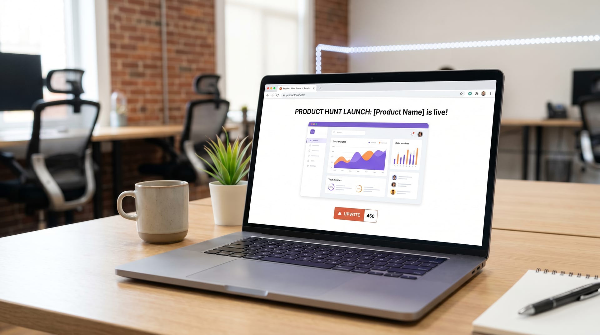
The first gallery image is the most critical. It should function as a standalone value proposition. Think of it as a billboard: if someone sees nothing else, they should understand what your product does and why it matters.
Thumbnail / Hero Image
Your thumbnail appears in the Product Hunt feed, in search results, and in social embeds. It is a 240 x 240 px square that must communicate your product’s essence at postage-stamp size.
Best practices for thumbnails:
- Use a single, bold icon or logo mark
- Avoid text entirely (it becomes illegible)
- Ensure high contrast against both light and dark backgrounds
- Test at 48 x 48 px (the smallest size PH displays)
Maker Avatar
Your maker avatar appears next to your name in comments and on the product page. While small, it humanizes your launch. Use a clear headshot with a neutral or branded background. Avoid logos here; people trust people.
Social Share Images
When your Product Hunt page is shared on Twitter, LinkedIn, or Slack, the platform pulls Open Graph metadata. You should prepare a dedicated 1200 x 630 px social share image that includes:
- Your product name and one-line description
- A compelling visual from your product
- Your branding
- A subtle call to action
Screenshot Best Practices
Creating screenshots that convert requires discipline. Here are the four non-negotiable principles.
Show Real UI, Not Mocks
Visitors can spot a fake screenshot instantly. Figma mockups with placeholder data undermine credibility. Use screenshots captured from your actual product, populated with realistic content.
If your product is pre-launch and lacks real data, generate synthetic but believable content. Tools like Mockaroo or even ChatGPT can produce realistic names, metrics, and activity feeds. The goal is plausibility, not perfection.
Highlight the “Aha Moment”
Every product has an “aha moment” — the instant a user understands the core value proposition. Your screenshots should lead visitors to that moment within two images.
For a project management tool, the aha moment might be a clean dashboard showing a completed workflow. For an AI writing assistant, it might be a side-by-side comparison of raw input and polished output. Identify your aha moment, then design your gallery sequence around it.
Use Annotations Sparingly
Annotations — arrows, circles, text callouts — can guide attention but easily become visual noise. Follow these rules:
- One annotation per image maximum
- Use consistent colors (your brand palette)
- Never annotate the first image (let the UI speak)
- Reserve annotations for complex features that need explanation
Red arrows scream “amateur.” Subtle, branded highlights whisper “professional.”
Maintain Consistent Branding
Your gallery images should feel like a cohesive set, not five random screenshots. Consistency signals polish and builds trust.
Standardize across your gallery:
- Background colors or gradients
- Font families and sizes
- Corner radius on device frames
- Shadow styles
- Accent colors for highlights
Create a screenshot style guide before you begin. It will save hours of rework and produce a gallery that looks intentionally designed.
Step-by-Step: Creating Gallery Images
Here is the exact workflow we recommend for producing a five-image Product Hunt gallery.
Step 1: Define Your Narrative Arc
Map your five images to a story:
| Image # | Purpose | Content |
|---|---|---|
| 1 | Hook | The product in its most impressive state; the promise |
| 2 | Context | The problem or workflow your product addresses |
| 3 | Aha Moment | The core feature or transformation in action |
| 4 | Proof | Results, metrics, or social validation |
| 5 | CTA | Next step: pricing, signup, or key differentiator |
Step 2: Capture Raw Screenshots
Use your product with realistic data. Capture at 2x resolution (2880 x 1800 for Mac, or use browser dev tools to set a high viewport). Avoid browser chrome, notification badges, and personal bookmarks.
For web apps, the “Capture full size screenshot” feature in Chrome DevTools is invaluable. For desktop apps, CleanShot X (Mac) or ShareX (Windows) offer pixel-perfect capture.
Step 3: Frame and Compose
Place your screenshots in device frames or clean canvases. For SaaS products, a browser frame with subtle shadow grounds the image. For mobile apps, use a minimal device frame (iPhone or Android) with generous padding.
The screenshot should occupy 70-80% of the canvas. The remaining space is for breathing room, subtle branding, or (on later images) sparse annotations.
Step 4: Add Text and Annotations
If you include text, make it large and concise. Each image should pass the “three-foot test”: readable when your monitor is three feet away. This ensures legibility at thumbnail scale.
Text formulas that work:
- “Before / After” comparisons
- “X in Y minutes” outcome statements
- “No-code” or “AI-powered” category labels
- One-word feature callouts (“Automate”, “Sync”, “Export”)
Step 5: Export and Compress
Export at the target dimensions (2400 x 1600 px). Use TinyPNG or Squoosh to compress without visible quality loss. Verify each file is under 5 MB. Preview the images in a small browser window to confirm readability.
App Store Screenshot Formula
If your Product Hunt launch includes a mobile app, your gallery should follow the App Store screenshot formula — adapted for Product Hunt’s wider aspect ratio.
The App Store formula is proven across millions of app downloads:
| Screenshot | Formula | Example |
|---|---|---|
| 1 | Value proposition headline + hero visual | "Track habits without the guilt" + clean calendar UI |
| 2 | Core feature demonstration | One-tap logging with smart suggestions |
| 3 | Social proof or results | "Join 50,000+ builders" + streak counter |
| 4 | Secondary feature or integration | Notion sync, widget, or Apple Health integration |
| 5 | Call to action | "Free forever. Upgrade anytime." + App Store badge |
For Product Hunt, adapt this formula to the wider canvas by placing the device frame on one side and the text on the other. This layout reads naturally left-to-right and maximizes space.
AI-Enhanced Screenshots with NeoSpark
Creating five polished gallery images from raw screenshots traditionally requires Figma expertise, hours of manual work, and design judgment many founders do not have. AI design tools have changed this equation.
NeoSpark is an AI-powered design platform built specifically for startup founders preparing launches. Here is how it streamlines Product Hunt image creation:
Automatic Screenshot Enhancement
Upload raw screenshots and NeoSpark’s AI cleans backgrounds, balances contrast, and suggests optimal cropping. The result is a gallery-ready image in seconds, not hours.
Smart Annotation
Instead of manually drawing arrows, describe what you want to highlight. NeoSpark generates subtle, on-brand annotations that guide attention without visual clutter.
Device Frame Generation
Place any screenshot into a realistic device frame — iPhone, Android, MacBook, or browser window — with consistent shadows and padding. No template hunting required.
Brand Consistency Enforcement
Upload your brand colors, fonts, and logo. NeoSpark applies them automatically across all five gallery images, ensuring a cohesive visual story.
One-Click Export
Export directly to Product Hunt specifications: 2400 x 1600 px, sRGB, under 5 MB, with compressed assets ready for upload.
The typical workflow with NeoSpark reduces gallery creation from 4-6 hours in Figma to 20-30 minutes. That time savings, two weeks before launch, can be redirected toward community building, outreach, and product stabilization — activities with higher marginal returns than pixel-pushing.
Launch Day Image Strategy
Your images are prepared. Here is how to deploy them strategically on launch day.
Upload Sequence
Product Hunt displays images in the order uploaded. Sequence matters:
- Lead with your strongest image (the hook)
- Follow with context and aha moment
- End with proof and CTA
You cannot reorder after upload without deleting and re-adding, so plan your sequence before you begin.
Timing Your Launch
Product Hunt resets at midnight Pacific Time. Upload your images the evening before, but do not publish until 12:01 AM PT. This ensures your images are processed and cached, reducing load times when traffic spikes.
Monitor Image Performance
Track which images generate the most engagement. Product Hunt’s maker dashboard shows click-through rates by image position. If image 3 underperforms, consider whether it clearly communicates value or needs clearer annotation.
Social Amplification
When sharing your Product Hunt link on Twitter or LinkedIn, attach your dedicated social share image (1200 x 630 px) rather than relying on PH’s auto-generated preview. Custom social images see 40% higher click-through rates on average.
Backup Assets
Have a “launch day emergency kit”:
- A sixth gallery image for mid-day updates
- A celebratory graphic for milestones (“#1 Product of the Day”)
- A thank-you graphic for your community
These assets keep momentum high and give you content to share beyond the initial announcement.
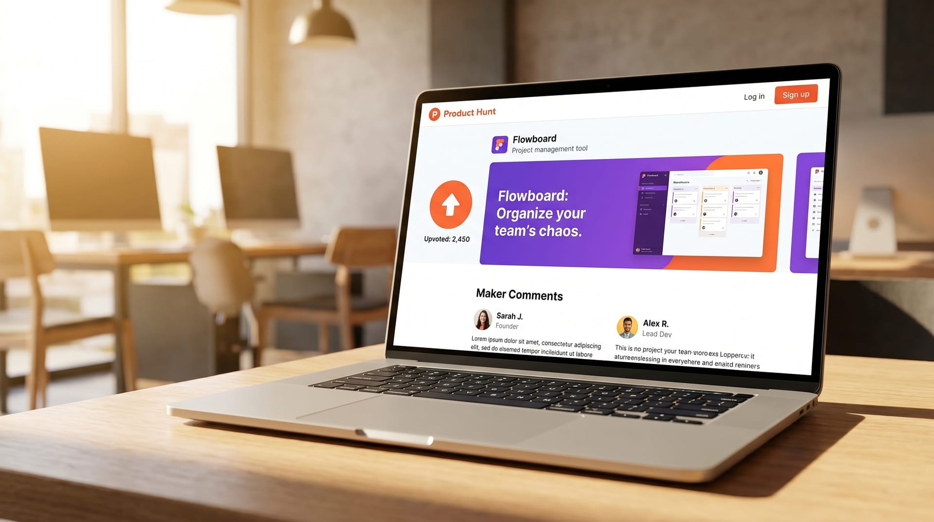
Case Studies of Successful PH Launches
Case Study 1: Reflect — #1 Product of the Day, March 2025
Reflect, a note-taking app with AI integration, launched on Product Hunt with a gallery that became a reference point for makers.
What they did right:
- Image 1 showed the cleanest writing interface in the category, with no annotations — pure product
- Image 2 demonstrated AI autocomplete in a split-screen before/after
- Image 3 displayed the graph view, a differentiated feature, with a single subtle highlight
- Images 4 and 5 showed mobile sync and end-to-end encryption badges
Results: 2,847 upvotes, #1 Product of the Day, 14,000 website visits in 24 hours.
Key lesson: Let the product speak first. Reflect’s first image had zero text, zero arrows, zero frames. The UI was so clean that annotations would have diminished it. This confidence signals maturity.
Case Study 2: Linear Mobile — #1 Product of the Week, January 2025
Linear, already an established brand, launched their mobile app on Product Hunt with a gallery that balanced brand recognition with feature education.
What they did right:
- Leveraged their iconic dark UI and purple accent color for instant brand recognition
- Used animated GIFs (supported by PH) to show gesture-based interactions
- Each image had a single, large text label: “Swipe to triage”, “Offline sync”, “Native feel”
- Maintained exact pixel consistency with their desktop product’s visual language
Results: 4,102 upvotes, #1 Product of the Week, 50,000+ app installs in 48 hours.
Key lesson: Consistency compounds. Linear’s gallery felt like an extension of their brand, not a one-off marketing asset. This coherence builds trust and reduces cognitive load for visitors already familiar with the product.
FAQ
How many images should I upload to Product Hunt?
Upload 3 to 5 images. Fewer than 3 looks incomplete; more than 5 dilutes attention. Five is the sweet spot for telling a complete story without overwhelming visitors.
What are the exact dimensions for Product Hunt gallery images?
Product Hunt recommends 2400 x 1600 px (3:2 ratio). A 4:3 ratio (2400 x 1800 px) also works well. The key is consistency: all images in your gallery should share the same aspect ratio.
Should I use GIFs or videos in my gallery?
Product Hunt supports GIFs but not videos in the gallery. Use GIFs sparingly — one animated image maximum — and keep file sizes under 5 MB. GIFs work well for demonstrating interactions but can distract from static UI shots.
Can I use mockups instead of real screenshots?
You can, but you should not. Real screenshots build trust. If your product lacks real data, generate believable synthetic data rather than using obvious placeholder content like “Lorem ipsum” or “John Doe.”
How do I make text readable at thumbnail size?
Use a minimum font size of 24 px at 2400 px width. Test by viewing your exported image at 240 px wide (10% scale). If you can read the text, it will be legible in Product Hunt’s interface.
What is the best tool for creating Product Hunt images?
Figma is the standard for manual design. For founders without design expertise, AI tools like NeoSpark automate framing, annotation, and brand consistency. The best tool is the one that produces professional results in the time you have available.
Should I update my images after launch?
Generally, no. Product Hunt penalizes edits that appear to manipulate engagement. However, if you discover a critical error (broken screenshot, outdated pricing), a single update is acceptable. Avoid changing images purely to “refresh” the page.
Conclusion
Product Hunt launch images are not a design afterthought. They are a conversion asset that deserves the same strategic attention as your landing page, your email sequence, and your outreach campaign.
The founders who win on Product Hunt understand a simple truth: visitors vote with their eyes first. A gallery that communicates value instantly, builds trust through consistency, and guides visitors toward an upvote will outperform a superior product with inferior visuals every time.
6 Key Takeaways
-
Invest disproportionately in image one. Seventy-three percent of upvoters never see image three. Your first image must stand alone as a complete value proposition.
-
Show real product, real data. Mockups and placeholder content destroy credibility. Capture your actual product populated with believable information.
-
Design for mobile first. Fifty-eight percent of Product Hunt traffic is mobile. Test every image at small sizes before upload.
-
Follow a narrative arc. Hook, context, aha moment, proof, CTA. This five-image story structure converts browsers into believers.
-
Annotate with restraint. One annotation per image, maximum. Subtle, branded highlights outperform aggressive red arrows.
-
Use AI to move faster. Tools like NeoSpark reduce gallery creation from hours to minutes, freeing you to focus on community, outreach, and product polish in the critical pre-launch window.
Your Product Hunt launch is a single day that can define your startup’s trajectory. Make every image count.
Related Resources
- NeoSpark Product Hunt Launch Kit — AI-generated gallery images, thumbnails, and social assets tailored for your product
- How to Write a Product Hunt Tagline That Converts — Pair great visuals with copy that drives action
- The Complete Product Hunt Launch Checklist — A week-by-week playbook for launch preparation
- NeoSpark Screenshot Enhancer — Upload raw screenshots and get launch-ready images in seconds
- Product Hunt Maker Dashboard Guide — Understand your analytics and optimize post-launch
Ready to create your Product Hunt launch images? Start with NeoSpark and generate your first gallery in under 10 minutes.