How to Design Event Programs: A Complete Guide for Planners & Coordinators
How to Design Event Programs: A Complete Guide for Planners & Coordinators
TL;DR: Designing an effective event program requires balancing information hierarchy, elegant typography, and audience-appropriate aesthetics. Start with a clear content audit, apply a consistent grid system, choose colors that match your event's emotional tone, and always proofread before print. For modern events, consider digital alternatives like QR-coded programs or dedicated event apps to reduce waste and enable real-time updates.
Table of Contents
- Why Event Programs Matter
- Event Program Design Fundamentals
- Program Types and Templates
- Step-by-Step Design Process
- Print Specifications
- Digital Program Alternatives
- Case Studies
- FAQ
- Conclusion
- Related Resources
Why Event Programs Matter
Event programs are far more than printed schedules. They serve as the primary navigational tool for attendees, set the aesthetic tone for the entire experience, and often become cherished keepsakes. A well-designed program communicates professionalism, reduces confusion, and reinforces brand identity.
Consider the following data on attendee behavior and program effectiveness:
| Metric | Statistic | Source / Context |
|---|---|---|
| Attendees who reference programs during events | 87% | EventMB Industry Report 2025 |
| Programs kept as mementos (weddings, galas) | 62% | WeddingWire Post-Event Survey |
| Attendee satisfaction increase with well-designed programs | +34% | PCMA Convene Magazine Study |
| Reduction in staff inquiries with clear programs | -41% | International Association of Exhibitions and Events |
| Programs influencing brand perception | 73% | Harvard Business Review Event Marketing Analysis |
These figures underscore a simple truth: investing in professional program design yields measurable returns in attendee satisfaction, operational efficiency, and brand reinforcement.
Event Program Design Fundamentals
Before selecting paper stock or choosing between serif and sans-serif, establish a solid foundation in the core principles of visual design. These fundamentals apply whether you are creating a folded card for an intimate wedding or a 32-page booklet for a multi-day conference.
Typography Hierarchy
Typography hierarchy guides the reader’s eye through content in order of importance. Without it, attendees struggle to locate critical information.
Primary Headings (Event Title / Program Header)
Use a display typeface at 24pt to 36pt. Serif fonts such as Cormorant Garamond, Playfair Display, or Bodoni convey elegance and tradition. Sans-serif options like Montserrat or Futura communicate modernity and clarity. Limit yourself to one display typeface per program.
Secondary Headings (Sections, Time Blocks)
Set at 14pt to 18pt, typically in the same family as the primary heading or a complementary sans-serif. Maintain consistent weight; bold or semi-bold works well. These headings should stand out clearly from body text without competing with the main title.
Body Text (Descriptions, Speaker Bios, Details)
Use a highly legible typeface at 10pt to 12pt with generous line spacing (120% to 140% of font size). Avoid going below 9pt, even for cost-saving purposes, as readability suffers significantly in dim event venues.
Accent Text (Quotes, Special Notes, Translations)
Italic or a secondary typeface at the same size as body text. Use sparingly to highlight readings, song lyrics, or multilingual content.
Practical Rule: Never use more than three typefaces in a single program. Two is ideal: one for headings and one for body text.
Layout Grids
A grid system brings order and consistency to your program layout. The most common grids for event programs include:
Single-Column Grid
Ideal for simple folded cards and ceremony programs. Content flows vertically in one clean stream. Easy to read but limited in information density.
Two-Column Grid
The standard for most booklet-style programs. Allows side-by-side scheduling, speaker photos with bios, or parallel multilingual text. Maintain a gutter of at least 1.5 picas (0.25 inches) between columns.
Modular Grid
Best for complex conference agendas with multiple tracks. Divide the page into uniform modules to place sessions, times, and room assignments in a scannable matrix.
Asymmetrical Grid
Suited for artistic or fashion-forward events. Creates visual interest but requires advanced design skill to maintain balance and readability.
When setting your grid, establish margins of at least 0.5 inches on all sides. For bound booklets, increase the inside margin (gutter) to 0.75 inches or more to accommodate binding.
White Space Usage
White space, or negative space, is the breathing room around and between elements. It is not empty space to be filled; it is an active design element that improves comprehension and elevates perceived quality.
Micro White Space
The space between letters, words, and lines. Proper letter-spacing (tracking) and line-height (leading) prevent text from feeling cramped. For body text in programs, a leading of 13pt to 14pt on 10pt type is generally comfortable.
Macro White Space
The larger areas of empty space around blocks of content, images, and page edges. Generous margins and padding between sections create a sense of luxury and clarity. High-end gala programs often use macro white space as a deliberate aesthetic choice.
Functional White Space
Space used to separate distinct pieces of information. For example, placing extra space between agenda items helps attendees quickly scan for the next session.
A common mistake among novice designers is fear of white space. Resist the urge to fill every corner. A program with adequate breathing room always appears more sophisticated than a cluttered one.
Color Psychology by Event Type
Color choices evoke emotional responses and set expectations. Select palettes that align with your event’s purpose and audience.
Weddings
Soft, muted palettes dominate. Blush, sage, dusty blue, and champagne convey romance and timelessness. Metallic accents in gold, rose gold, or copper add luxury. Avoid overly bright or clashing colors that distract from the ceremonial atmosphere.
Corporate Conferences
Professional and restrained. Navy, charcoal, and white form a trustworthy base. Accent colors drawn from the host company’s brand guidelines maintain consistency. Use color coding for different tracks or session types to aid navigation.
Music Festivals
Bold, energetic, and expressive. Vibrant oranges, magentas, electric blues, and neon greens reflect the creative spirit. Gradients and duotone image treatments are popular. Legibility remains important; ensure text contrasts sufficiently against busy backgrounds.
Gala Dinners and Fundraisers
Deep, rich tones signal sophistication. Burgundy, emerald, midnight blue, and black create an atmosphere of exclusivity. Gold and silver foil stamping or embossing elevate the tactile experience.
Graduation Ceremonies
Institutional colors take precedence. University or school colors should feature prominently, paired with neutral backgrounds for readability. Crimson, royal blue, and forest green are traditional choices.
Always test your color palette in grayscale to ensure information hierarchy remains clear for attendees with color vision deficiencies or for black-and-white photocopies.
Program Types and Templates
Different events demand different program formats. Understanding the standard structures for each type will accelerate your design process and ensure you include all necessary information.
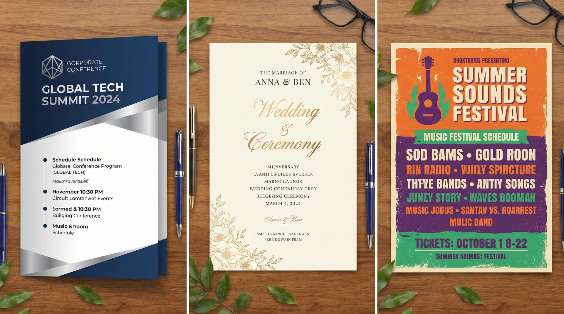
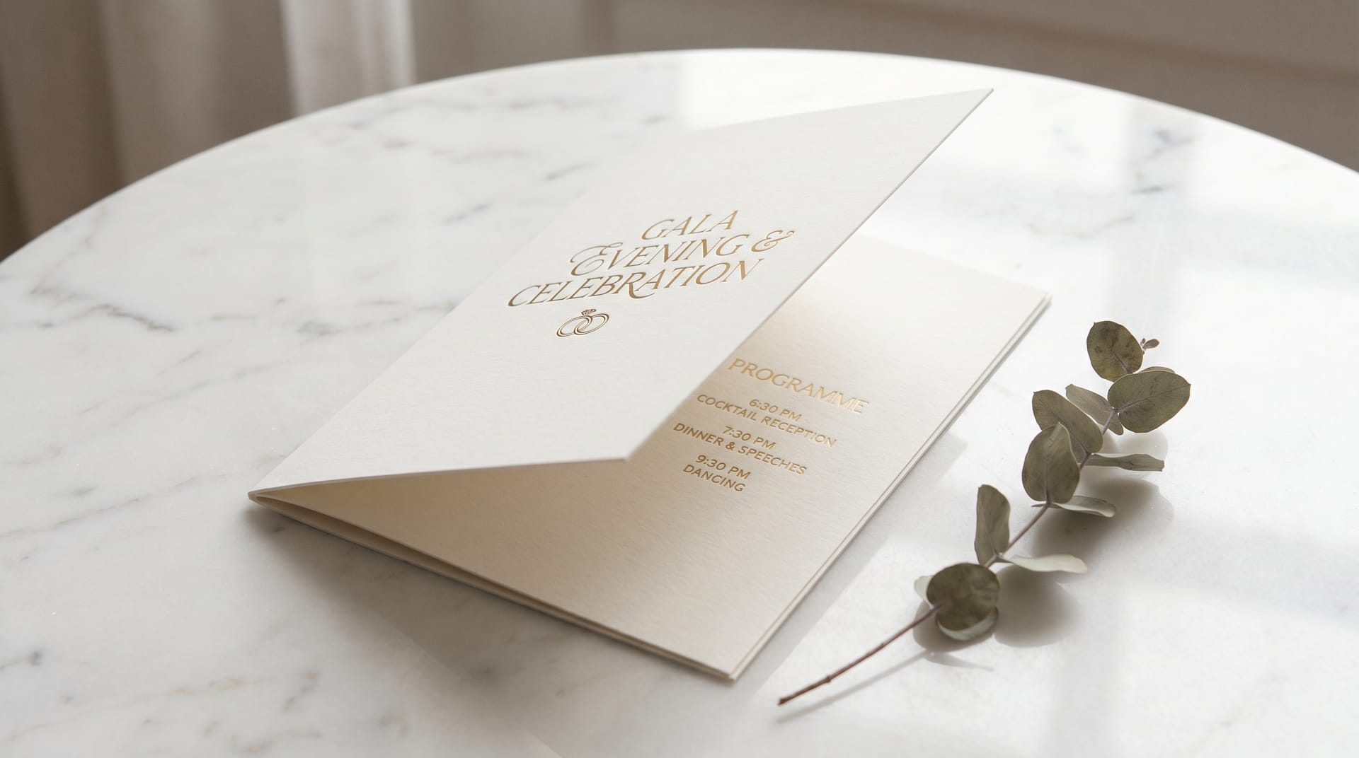
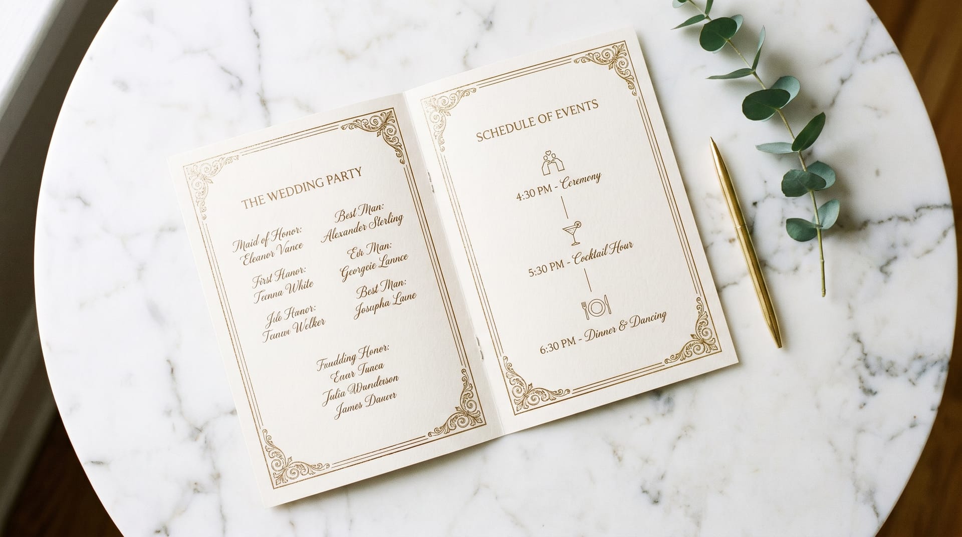
Wedding Ceremony Programs
Wedding programs are typically single-sheet, bi-fold, or tri-fold cards distributed at the ceremony entrance.
Standard Content:
- Couple’s names and wedding date
- Order of ceremony (processional, readings, vows, ring exchange, recessional)
- Names of officiant, musicians, and readers
- Song lyrics or poem texts
- Acknowledgment of deceased loved ones (optional but common)
- Thank-you message to guests
Design Considerations:
Wedding programs favor romantic typography and ample white space. Floral illustrations, monograms, and watercolor washes are popular decorative elements. Paper choices significantly impact perceived quality; consider cotton stock, vellum overlays, or deckle edges for luxury weddings.
Common Sizes: 5 x 7 inches (portrait), 4.25 x 11 inches (tall fold), 8.5 x 5.5 inches (landscape fold)
Corporate Conference Agendas
Conference programs range from pocket-sized schedules to comprehensive multi-page booklets.
Standard Content:
- Conference title, dates, and venue
- Welcome letter from organizers or keynote preview
- Detailed schedule with times, session titles, speakers, and room numbers
- Speaker bios and headshots
- Sponsor recognition and advertisements
- Venue maps and networking area layouts
- Social event and meal information
- WiFi credentials and app download instructions
Design Considerations:
Clarity and scannability are paramount. Attendees need to find sessions quickly while walking between rooms. Use consistent color coding for tracks, clear time indicators, and prominent room numbers. Include ample space for attendees to take notes.
Common Sizes: 5.5 x 8.5 inches (half-letter), 6 x 9 inches, 8.5 x 11 inches (full letter)
Music Festival Schedules
Festival programs must withstand outdoor conditions while presenting dense scheduling information across multiple stages.
Standard Content:
- Festival branding and dates
- Stage-by-stage schedule with set times
- Artist lineup with brief descriptions or genres
- Site map with stage locations, restrooms, first aid, and food vendors
- Rules and safety information
- Merchandise and sponsor listings
Design Considerations:
Durability matters. Consider waterproof or tear-resistant paper stock. High-contrast designs improve readability in bright sunlight. Pocket-sized folded formats or lanyard cards allow hands-free carrying. Grid-based layouts help attendees compare simultaneous performances across stages.
Common Sizes: 4 x 9 inches (pocket fold), 11 x 17 inches (poster fold), lanyard card 4 x 6 inches
Gala Dinner Programs
Gala programs balance the practical needs of a seated dinner with the ceremonial requirements of awards, speeches, and entertainment.
Standard Content:
- Event title and benefiting organization
- Table of contents or evening timeline
- Menu courses and wine pairings
- Program of speeches, presentations, and performances
- Award categories and nominees or recipients
- Silent auction item listings
- Donor recognition and sponsorship tiers
- Board of directors and organizing committee
Design Considerations:
Gala programs are often the most luxurious event collateral produced. Embossing, foil stamping, spot UV coating, and ribbon bookmarks are common embellishments. The program may double as a menu and auction catalog, requiring careful information architecture.
Common Sizes: 5.5 x 8.5 inches, 6 x 9 inches, 8.5 x 11 inches (perfect bound for extensive auction catalogs)
Graduation Ceremonies
Graduation programs are typically straightforward booklets distributed to families and graduates.
Standard Content:
- Institution name, seal, and ceremony date
- Order of exercises (processional, national anthem, speeches, conferring of degrees)
- Names of graduating students (sometimes listed by program or honors level)
- Faculty and administration names
- Commencement speaker biography
- Degree requirements summary
Design Considerations:
Institutional branding guidelines must be followed precisely. Programs are often kept as mementos for decades, so timeless design choices outperform trendy ones. When listing hundreds of graduate names, prioritize clean typography and generous spacing to prevent errors and omissions.
Common Sizes: 5.5 x 8.5 inches, 8.5 x 11 inches (folded), 6 x 9 inches
Step-by-Step Design Process
Follow this structured workflow to produce professional event programs efficiently and consistently.
Step 1: Content Audit and Collection
Gather all text, images, logos, and sponsor materials before opening your design software. Confirm final copy with stakeholders. Late content changes are the leading cause of missed deadlines and budget overruns in program design.
Step 2: Define the Format and Specifications
Determine the physical size, page count, binding method, and paper stock in consultation with your printer. These decisions affect layout margins, color profiles, and file preparation requirements.
Step 3: Establish the Visual System
Select your typefaces, color palette, and grid structure. Create a simple style guide documenting heading styles, body text formatting, color values (CMYK and Pantone), and spacing rules. This ensures consistency across all pages.
Step 4: Build the Master Pages and Grid
In your design software, set up master pages with running headers, footers, page numbers, and background elements. Establish your column grid and margin specifications.
Step 5: Place Content in Hierarchy Order
Begin with the most critical information: event title, schedule, and key names. Then fill in secondary content: descriptions, bios, and supplementary details. Decorative elements come last.
Step 6: Refine Typography and Spacing
Adjust type sizes, leading, tracking, and paragraph spacing. Ensure comfortable reading flow. Pay special attention to widows, orphans, and awkward line breaks in headings.
Step 7: Incorporate Imagery and Graphics
Place photos, illustrations, maps, and decorative elements. Ensure all images are high resolution (300 DPI at print size) and properly color-corrected for CMYK output.
Step 8: Proofread and Review
Conduct multiple rounds of proofreading. Check names, titles, dates, times, and room numbers with particular care. Have at least one other person review the design for errors and clarity.
Step 9: Prepare Print-Ready Files
Export files according to your printer’s specifications. Typically this means PDF/X-1a or PDF/X-4 format with bleeds, crop marks, and embedded fonts. Include a separate low-resolution PDF for client approval.
Step 10: Print Proof and Final Production
Request a physical or digital press proof for large runs. Review color accuracy, paper stock, and binding. Once approved, proceed to full production with adequate lead time for delivery.
Print Specifications
Understanding standard print specifications helps you communicate effectively with vendors and make informed budget decisions.
| Specification | Standard Options | Best For | Notes |
|---|---|---|---|
| Standard Sizes | 4x6", 5x7", 5.5x8.5", 6x9", 8.5x11", 11x17" | All event types | Custom sizes increase cost; choose standard sizes for budget efficiency |
| Paper Weight | 80 lb text, 100 lb text, 80 lb cover, 100 lb cover | Text for booklets; cover for cards | Higher weight feels more premium but adds bulk and shipping cost |
| Paper Finish | Gloss, matte, silk, uncoated, linen, cotton | Matte for elegance; gloss for photos; uncoated for writing | Uncoated stock absorbs ink, producing softer colors |
| Binding | Saddle stitch, perfect bound, spiral, folded (no binding) | Saddle stitch up to 64 pages; perfect bound for thicker | Page count must be divisible by 4 for saddle stitch |
| Color | CMYK 4-color, Pantone spot color, black + spot | CMYK for photos; Pantone for brand accuracy | Spot colors increase cost but ensure color consistency |
| Finishing | Foil stamping, embossing, spot UV, die cutting, rounded corners | Gala and luxury weddings | Each finishing technique requires separate production passes |
| Bleed | 0.125 inches (1/8 inch) on all sides | Any design with full-bleed images or backgrounds | Extend background colors and images beyond trim line |
When requesting quotes from printers, provide the finished size, page count, paper preference, quantity, binding type, and any finishing requirements. Order 10% more programs than your expected attendance to account for last-minute guests and keepsake requests.
Digital Program Alternatives
Physical programs remain valuable, but digital alternatives offer compelling advantages in flexibility, sustainability, and cost. The most effective modern events often combine both approaches.
QR Code Programs
Place a QR code on a simple printed card or table tent that links to a mobile-optimized web page. Benefits include real-time schedule updates, interactive maps, and click-to-calendar integration. If a speaker cancels or a room changes, the digital program updates instantly without reprinting.
Best practices for QR code programs: test scanning under event lighting conditions, provide a short URL as a fallback, ensure the landing page loads quickly on mobile networks, and design for thumb-friendly navigation.
Event Mobile Apps
Dedicated event apps provide the richest digital experience. Features typically include personalized schedules, speaker profiles, networking tools, live polling, push notifications for schedule changes, and sponsor showcases.
For conferences and large festivals, apps justify their development cost through enhanced attendee engagement and sponsor value. However, they require attendees to download and learn a new interface, which creates friction for older or less tech-savvy audiences.
PDF Downloads
The simplest digital option: email attendees a PDF program before the event or host it on the event website. PDFs preserve your exact design layout and work offline once downloaded. They are ideal for corporate events where attendees prefer to review agendas on tablets or laptops.
Hybrid Approach
Many planners now provide a minimal physical program (a folded card with key information and a QR code) alongside a comprehensive digital version. This satisfies attendees who want a tangible keepsake while delivering the flexibility of digital content.
Case Studies
Case Study 1: The Meridian Corporate Summit Program Redesign
Challenge: The Meridian Corporate Summit, a three-day technology conference with 2,400 attendees, had historically produced a 48-page perfect-bound program that cost $18,000 to print and was frequently outdated by day two due to schedule changes.
Solution: The design team transitioned to a hybrid model. A 16-page saddle-stitch “essentials” booklet was produced with the schedule grid, venue map, and welcome content. A comprehensive digital program was hosted on a mobile-optimized site accessed via QR codes printed on the booklet cover and session room signage.
Results: Print costs dropped to $6,200. Real-time schedule updates reduced staff inquiries by 53%. Post-event surveys showed 78% of attendees used the digital program, and 91% rated the new format as “better” or “much better” than the previous all-print approach. The physical booklet, now slimmer and more focused, was kept as a reference by 44% of attendees.
Key Takeaway: Reducing print scope and adding digital functionality can simultaneously cut costs and improve attendee experience.
Case Study 2: The Hawthorne Estate Wedding Program
Challenge: A luxury wedding planner needed ceremony programs for a 180-guest black-tie wedding that matched the event’s refined aesthetic while accommodating bilingual content (English and French) for the groom’s family.
Solution: The designer created a 5 x 7 inch bi-fold program on 120 lb cotton paper with a soft-touch laminate. The front panel featured the couple’s custom monogram in gold foil stamping. Inside, an asymmetrical two-column layout presented English on the left and French on the right, connected by subtle timeline markers. The typography paired Cormorant Garamond for headings with Source Sans Pro for body text.
Results: The programs became a focal point of guest conversation, with many photographed for social media. The cotton stock and foil detailing aligned with the wedding’s luxury positioning. The bilingual layout, tested with both families beforehand, ensured all guests could follow the ceremony comfortably.
Key Takeaway: Material quality and finishing details can elevate a simple program into a memorable design object that reinforces the event’s overall aesthetic.
FAQ
How far in advance should I start designing an event program?
Begin the design process four to six weeks before the event. This allows time for content collection, design iterations, stakeholder approvals, printing, and delivery. For complex programs with extensive finishing (foil, embossing), add an additional two weeks.
What is the minimum font size for readable event programs?
Do not go below 9pt for body text. In dimly lit venues such as ballrooms or theaters, 10pt to 11pt is safer. Headings should be significantly larger to establish clear hierarchy. Always print a sample and review it under lighting conditions similar to the event venue.
Should I design in RGB or CMYK for printed programs?
Always design in CMYK for print projects. RGB colors, used for screen display, often shift dramatically when converted to CMYK for printing. If your brand colors are defined in Pantone, use those values directly for the most accurate reproduction.
How do I handle last-minute changes to the program after printing?
For minor changes, printed errata slips or verbal announcements may suffice. For significant changes, digital programs accessed via QR code allow instant updates. Some planners keep a small quantity of blank program pages or sticker sheets for emergency corrections. Building a buffer day into your production schedule helps accommodate unforeseen revisions.
What paper stock feels the most luxurious for wedding and gala programs?
Cotton paper (such as Crane’s Lettra), textured linen stock, and heavyweight cover stock with soft-touch or velvet lamination convey luxury. Adding finishing techniques like foil stamping, letterpress, or embossing further elevates the tactile experience. These choices increase cost but create a lasting impression appropriate for milestone events.
Can I design event programs if I have no graphic design experience?
Yes. Template-based tools like NeoSpark offer professionally designed program templates that you can customize with your content. Focus on selecting a template appropriate for your event type, replacing placeholder text with final copy, and exporting print-ready files. For high-stakes events (major galas, large conferences), consider hiring a professional designer.
How many programs should I print?
Order approximately 10% to 15% more than your expected attendance. This covers last-minute guests, keepsake requests, and potential errors. For weddings, many couples order one per guest or one per couple. For conferences, one per attendee is standard, with a small surplus for walk-in registrations.
Conclusion
Designing event programs that inform, guide, and delight requires attention to both practical information design and emotional aesthetic choices. The most successful programs balance clarity with beauty, ensuring attendees can navigate the event while absorbing the intended atmosphere.
Six Key Takeaways:
-
Start with content, not decoration. Finalize all text, names, and schedules before designing to avoid costly revisions.
-
Establish clear typography hierarchy. Limit yourself to two or three typefaces and use size, weight, and spacing to guide readers through information.
-
Choose colors that match the event’s emotional tone. Soft palettes for weddings, professional tones for conferences, bold energy for festivals, and rich depth for galas.
-
Respect the grid and white space. Structured layouts with adequate breathing room always appear more professional than cluttered designs.
-
Select print specifications appropriate to the event’s importance. A gala program deserves heavier stock and finishing; a festival schedule needs durability and portability.
-
Consider digital alternatives for flexibility. QR codes and event apps enable real-time updates and reduce waste without eliminating the value of printed materials.
By applying these principles, event planners, wedding coordinators, and conference organizers can produce programs that serve their functional purpose while elevating the entire event experience.
Related Resources
- NeoSpark Event Program Templates — Browse professionally designed templates for weddings, conferences, galas, and more.
- How to Choose the Perfect Typography for Your Brand — A deeper dive into typeface selection and pairing strategies.
- Print Design Fundamentals: Color Modes and File Preparation — Ensure your programs look as intended when they come off the press.
- Designing with Grids: A Practical Guide — Master layout grids for cleaner, more professional compositions.
- NeoSpark Design Tool — Create event programs, invitations, and collateral with our browser-based design platform.