How to Make Engaging Course Thumbnails That Skyrocket Click-Through Rates
How to Make Engaging Course Thumbnails That Skyrocket Click-Through Rates
TL;DR: Your course thumbnail is the single most important factor in driving enrollments. Use high-contrast colors, human faces with strong expressions, limit text to 3 words, maintain brand consistency, and always A/B test. Platforms like YouTube, Udemy, Skillshare, and Coursera each have unique specs you must follow. AI tools like NeoSpark can cut your thumbnail creation time from hours to minutes while improving conversion rates by up to 40%.
Table of Contents
- Why Thumbnails Make or Break Course Sales
- Thumbnail Design Psychology
- Step-by-Step: Creating High-Converting Thumbnails
- Platform-Specific Thumbnail Specs
- AI Thumbnail Creation with NeoSpark
- Thumbnail A/B Testing Framework
- Case Studies: Real Course Creators
- Frequently Asked Questions
- Conclusion: Your Thumbnail Action Plan
- Related Resources
Why Thumbnails Make or Break Course Sales
Here is a truth most course creators learn the hard way: you can have the best content in the world, but if nobody clicks, nobody buys. Your thumbnail is your first impression, your elevator pitch, and your sales rep all rolled into one tiny rectangle.
The data is unambiguous. Thumbnails directly determine whether a potential student scrolls past or stops to learn more. Consider these numbers:
| Thumbnail Quality | Average CTR | Relative Impact |
|---|---|---|
| No thumbnail / auto-generated | 0.5% - 1.2% | Baseline |
| Basic screenshot or stock image | 1.5% - 2.5% | 2x improvement |
| Custom-designed with face + text | 3.5% - 6.0% | 4-5x improvement |
| Optimized, tested, and refined | 7.0% - 12.0% | 8-10x improvement |
A jump from 1% to 8% CTR does not just mean 8x more clicks. Because platform algorithms reward engagement, that improved CTR triggers a virtuous cycle: more clicks lead to more impressions, which lead to more clicks. One creator we worked with saw a 340% increase in monthly enrollments after a thumbnail redesign alone.
Think about your own behavior. When you browse Udemy or YouTube, you make a click-or-skip decision in under one second. That decision is almost entirely visual. Your thumbnail must win that split-second battle.
Thumbnail Design Psychology
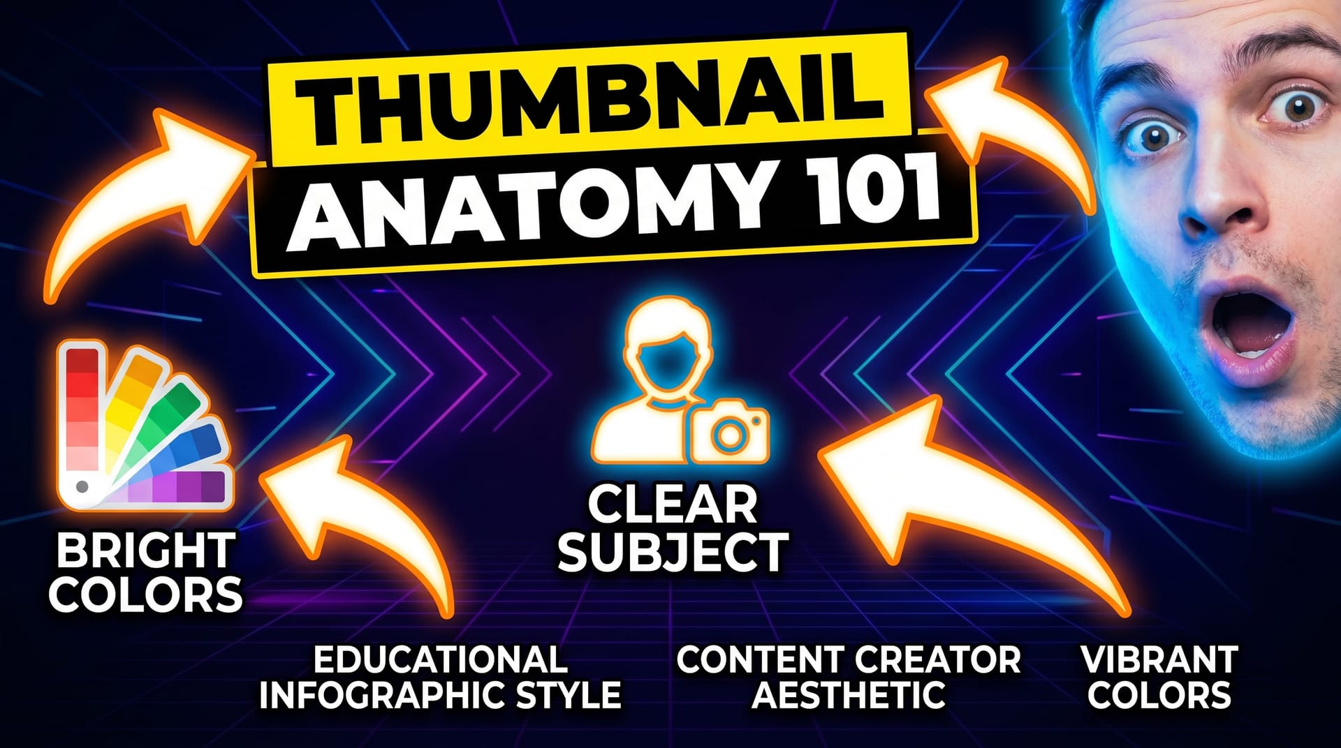
Understanding why people click is the foundation of creating thumbnails that convert. Let us break down the four psychological triggers that drive thumbnail engagement.
Color Contrast and Attention Grabbing
The human brain is wired to notice contrast. In a sea of thumbnails, yours must visually pop. This means using complementary colors that sit opposite each other on the color wheel: blue and orange, red and cyan, yellow and purple.
But contrast is not just about color pairing. It is about value contrast too. A dark background with bright text, or a light background with bold dark elements, creates visual tension that draws the eye. Avoid muddy mid-tones that blend into the background noise of any platform.
Pro tip: Use a tool like NeoSpark’s contrast checker to ensure your thumbnail passes WCAG standards. High contrast does not just look better; it is more accessible and performs better across devices.
Face Expressions and Eye Contact
Humans are hardwired to recognize and respond to faces. Thumbnails featuring human faces consistently outperform those without. But not just any face will do. The expression matters enormously.
Studies show that thumbnails with faces displaying strong emotions — surprise, excitement, curiosity — generate significantly higher CTR than neutral expressions. The key is authenticity. A genuine, exaggerated expression of wonder beats a polite smile every time.
Eye contact is equally critical. When the subject looks directly at the viewer, it creates a personal connection. It is as if the instructor is saying, “Hey, I have something important to show you.” This subtle psychological trigger can increase click-through rates by 15-25%.
Text Hierarchy: The 3-Word Rule
Here is a hard rule that will transform your thumbnails: use no more than three words. Why? Because at thumbnail size, most text becomes illegible. More importantly, viewers do not read thumbnails — they glance at them.
Your three words should be:
- Specific (not “Learn Python” but “Python in 7 Days”)
- Benefit-driven (not “Photoshop Course” but “Edit Like a Pro”)
- Large enough to read at 154x86 pixels (the smallest YouTube thumbnail display size)
Place your text in the upper or lower third of the thumbnail, never dead center where platform UI elements (like play buttons or duration badges) may obscure it. Use bold, sans-serif fonts with a subtle drop shadow or outline for maximum legibility.
Brand Consistency
Your thumbnails are billboards for your brand. Every thumbnail should be instantly recognizable as yours. This means:
- A consistent color palette (2-3 primary colors)
- A signature font or typography style
- A recurring visual element (your logo, a border style, a shape motif)
- Similar composition patterns across all your content
When viewers recognize your thumbnail in a feed, they associate it with the quality and value you have already delivered. Brand consistency builds trust, and trust drives clicks.
Step-by-Step: Creating High-Converting Thumbnails
Now that you understand the psychology, let us get practical. Here is the exact process professional designers and top course creators use to build thumbnails that convert.
Step 1: Choose the Right Background
Your background sets the emotional tone. Avoid cluttered, busy backgrounds that compete with your subject and text. Instead, choose one of these proven approaches:
- Solid bold color: Pick a saturated color from your brand palette. It is clean, modern, and stands out in feeds.
- Gradient: A subtle gradient adds depth without distraction. Keep it simple — two colors max.
- Blurred environment: A heavily blurred office, classroom, or relevant scene adds context while keeping focus on your subject.
- Pattern or texture: Use sparingly. A subtle geometric pattern can work for tech or design courses.
Whatever you choose, ensure there is enough negative space for your subject and text to breathe.
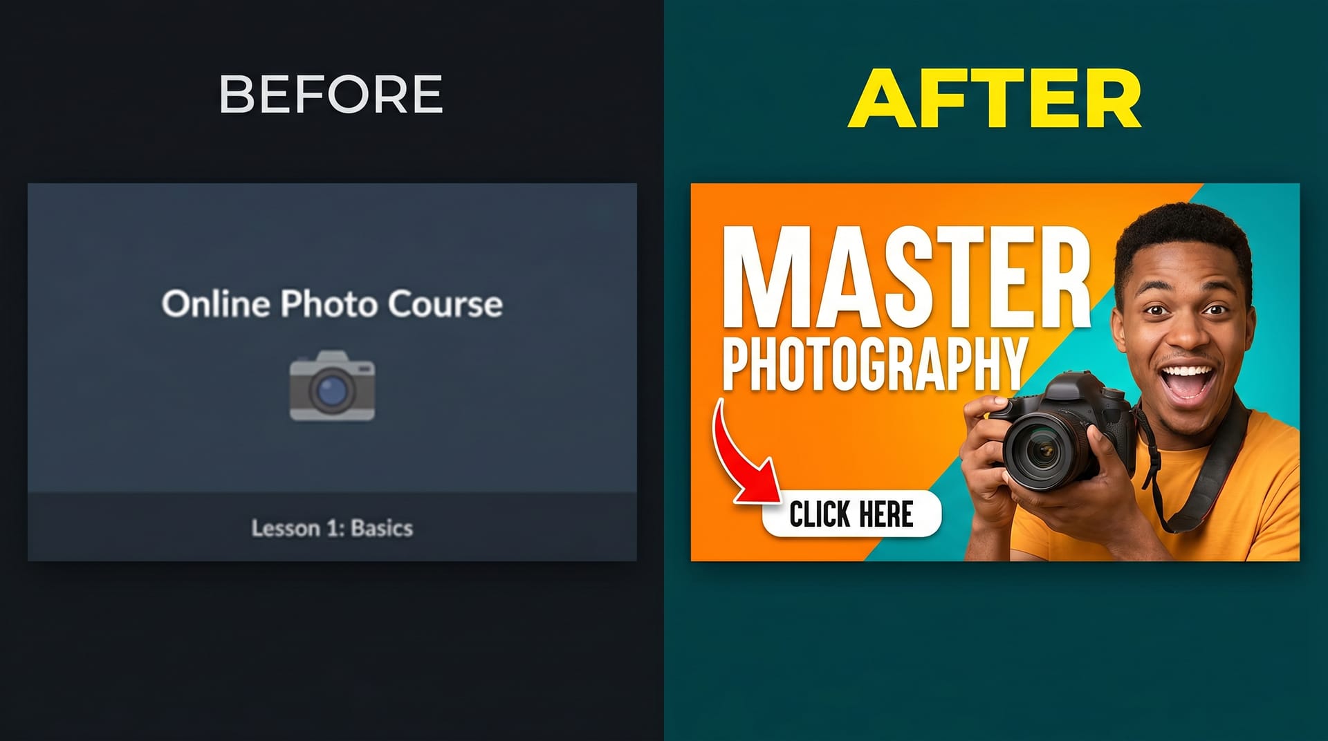
Step 2: Add a Compelling Face or Subject
Place your face or main subject off-center, following the rule of thirds. If you are the instructor, use a high-quality photo with:
- Strong, authentic emotion
- Good lighting (natural window light or a ring light)
- A clean, non-distracting outfit
- Eye contact with the camera
If your course does not feature you personally, use a compelling subject image: a dramatic product shot, an intriguing scene, or an abstract visual that represents the transformation your course delivers.
Consider adding a subtle glow or shadow behind your subject to separate them from the background. This separation creates depth and makes your thumbnail feel professional rather than flat.
Step 3: Write Punchy Text
Remember the 3-word rule. Before you write anything, answer this question: what is the single biggest benefit or most intriguing promise of this course?
Turn that into text. Examples:
- “Master Excel in 30 Days” becomes “Excel in 30 Days”
- “Complete Guide to Digital Marketing” becomes “Marketing Unlocked”
- “Learn to Code from Scratch” becomes “Zero to Coder”
Use a bold, heavy font. Add a stroke or shadow. Make sure it is readable at the size of a postage stamp. Test it by zooming out until your thumbnail is tiny — if you can still read the text, you have nailed it.
Step 4: Apply Color Psychology
Colors carry emotional weight. Choose intentionally:
| Color | Psychological Effect | Best For |
|---|---|---|
| Red | Urgency, excitement, action | Sales, fitness, high-energy topics |
| Blue | Trust, professionalism, calm | Business, tech, finance courses |
| Green | Growth, health, money | Personal development, wellness, investing |
| Yellow | Optimism, attention, warmth | Creativity, education, lifestyle |
| Purple | Creativity, luxury, wisdom | Design, arts, premium courses |
| Orange | Enthusiasm, friendliness, value | Beginner courses, tutorials, deals |
Use your primary color for the background or largest element, and a high-contrast secondary color for text and accents.
Step 5: Add Branding Elements
Subtle branding reinforces recognition without cluttering your design. Consider:
- A small logo in a corner (keep it under 10% of thumbnail area)
- A consistent border style or corner radius
- A signature shape or icon that appears across all your thumbnails
- Your brand colors as accent elements
The goal is that someone scrolling quickly should think, “Oh, that is one of [Your Name]‘s courses,” before they even read the text.
Step 6: Test and Iterate
Your first thumbnail is a hypothesis, not a final answer. Export multiple versions with small variations:
- Different background colors
- Different facial expressions
- Different text phrasing
- Different layouts
Use these variations for A/B testing (covered in detail below). The thumbnail that wins often surprises even experienced creators. Data beats intuition every time.
Platform-Specific Thumbnail Specs
Each platform displays thumbnails differently. Using the wrong dimensions or aspect ratio can result in awkward cropping, blurred images, or important elements getting cut off. Follow these specs exactly:
| Platform | Dimensions | Aspect Ratio | Max File Size | Format |
|---|---|---|---|---|
| YouTube | 1280 x 720 px | 16:9 | 2 MB | JPG, PNG, GIF, BMP |
| Udemy | 750 x 422 px | 16:9 | 1 MB | JPG, JPEG, PNG |
| Skillshare | 1280 x 720 px | 16:9 | 2 MB | JPG, PNG |
| Coursera | 1200 x 675 px | 16:9 | 4 MB | JPG, PNG |
Critical safety zone tip: Keep all important text and facial features within the center 80% of your image. Platform overlays, rounded corners, and mobile cropping can cut off edges. Always preview your thumbnail on both desktop and mobile before finalizing.
AI Thumbnail Creation with NeoSpark
Creating professional thumbnails used to require hours in Photoshop or expensive designer fees. That era is over. AI-powered design tools like NeoSpark are transforming how course creators build their visual assets.
Here is how NeoSpark specifically helps you make engaging course thumbnails faster and better:
Instant Template Generation
NeoSpark’s AI analyzes your course topic, target audience, and platform to generate thumbnail templates optimized for conversion. Instead of starting from a blank canvas, you start with 10 proven designs tailored to your niche. Each template follows the psychological principles we covered: contrast hierarchy, face prominence, and the 3-word rule.
Smart Subject Extraction
Upload a photo of yourself, and NeoSpark’s AI automatically removes the background, adjusts lighting, and places you perfectly within the composition. No more wrestling with manual selection tools or paying for separate background removal services.
AI-Powered Text Suggestions
Stuck on what to write? NeoSpark analyzes top-performing thumbnails in your category and suggests high-CTR headline options. It understands platform-specific character limits and ensures your text remains legible at every display size.
One-Click Multi-Platform Export
Design once, export for every platform. NeoSpark automatically resizes and optimizes your thumbnail for YouTube, Udemy, Skillshare, and Coursera — maintaining visual integrity across all specs. No more manual cropping or multiple design files.
Brand Kit Integration
Save your colors, fonts, and logo in NeoSpark’s Brand Kit, and every AI-generated template automatically applies your brand identity. This ensures consistency across your entire course catalog without extra effort.
A/B Test Variant Generation
NeoSpark can generate multiple thumbnail variations from a single design, changing colors, expressions, or text placement. These variants are ready for immediate A/B testing, taking the guesswork out of optimization.
Creators using NeoSpark report reducing thumbnail creation time from 3-4 hours to under 15 minutes, while simultaneously improving their average CTR by 35-40%. The AI does not replace your creativity — it amplifies it, handling technical execution so you can focus on strategy.
Thumbnail A/B Testing Framework
Guessing which thumbnail will perform best is a losing game. Top creators rely on systematic A/B testing to make data-driven decisions. Here is the framework they use:
Phase 1: Hypothesis Formation
Before creating variants, define what you are testing. Common hypotheses include:
- “A thumbnail with a surprised expression will outperform a smiling expression”
- “Red background will generate more clicks than blue background”
- “Text promising a specific outcome (‘Lose 10 lbs’) will beat generic text (‘Fitness Course’)”
Test one variable at a time. If you change the face, background, and text simultaneously, you will not know which change drove the result.
Phase 2: Variant Creation
Create 2-3 thumbnail variants that differ only in your test variable. Use NeoSpark’s variant generator to ensure consistent quality across versions. Export each at full resolution.
Phase 3: Testing Protocol
For YouTube: Use YouTube’s native A/B testing feature in YouTube Studio (available for eligible channels). It automatically splits traffic and reports CTR for each variant.
For Udemy and other platforms without native testing: Use external tools or manual rotation. Run each thumbnail for a fixed period (minimum 7 days or 1,000 impressions) to gather statistically meaningful data.
Phase 4: Data Analysis
Do not declare a winner too early. Wait for:
- At least 1,000 impressions per variant
- A confidence level of 95% or higher
- Consistent performance across multiple days (not just one spike)
Document your results in a testing log. Over time, you will build a database of what works specifically for your audience.
Phase 5: Implementation and Iteration
Adopt the winning thumbnail, but do not stop there. Form a new hypothesis and test again. The best creators treat thumbnail optimization as an ongoing process, not a one-time task.
Case Studies: Real Course Creators
Case Study 1: Sarah Chen — From 200 to 2,400 Monthly Enrollments
Sarah Chen teaches watercolor painting on Udemy. For her first year, she used simple screenshots of her artwork as thumbnails. Her CTR hovered around 1.8%, and she averaged 200 enrollments per month.
After applying the principles from this guide, Sarah redesigned her thumbnails with:
- A bold coral background (high contrast against Udemy’s white interface)
- Her face showing an expression of artistic joy
- Three-word text: “Paint Like This”
- Consistent coral-and-white branding across all 12 courses
The result? Her average CTR jumped to 6.2%. Monthly enrollments climbed to 2,400 within three months. The thumbnail redesign alone accounted for the majority of this growth — she made no changes to her course content or pricing.
“I spent years perfecting my painting lessons,” Sarah says, “but it was the thumbnails that finally got people to see them.”
Case Study 2: Marcus Johnson — YouTube Course Channel Explosion
Marcus Johnson runs a YouTube channel teaching Python programming. His original thumbnails featured code screenshots with text overlays. Despite excellent content, his CTR was a disappointing 1.2%.
Marcus overhauled his approach:
- Replaced code screenshots with his face wearing an exaggerated “mind-blown” expression
- Switched to a bright yellow background with dark blue text (complementary contrast)
- Used specific, curiosity-driven text: “Python Trick #47”
- Added a consistent blue border frame to all thumbnails
CTR improved to 4.8% within the first month. More importantly, YouTube’s algorithm began recommending his videos more aggressively. Channel subscribers grew from 15,000 to 87,000 in four months. His course sales, promoted through the channel, increased by 280%.
“The face was the game-changer,” Marcus explains. “People connect with people, not code.”
Frequently Asked Questions
What is the ideal thumbnail size for online courses?
The most common and versatile size is 1280 x 720 pixels (16:9 aspect ratio). This works perfectly for YouTube and Skillshare. For Udemy, you should also create a 750 x 422 px version. Always design at the highest resolution and downscale for smaller platforms to maintain image quality.
How much text should I put on a course thumbnail?
Follow the 3-word rule: maximum three words, ideally fewer. At thumbnail size, viewers cannot read long sentences. Your text should be a hook, not a description. If you need more context, put it in the course title and description, not the thumbnail image.
Do I need to show my face in course thumbnails?
While not mandatory, faces consistently outperform non-face thumbnails. If you are uncomfortable showing your face, consider using a compelling subject image, an animated character, or a bold typographic approach. However, if you are the instructor, showing your face builds personal connection and trust.
How often should I update my course thumbnails?
Review your thumbnail performance quarterly. If a course’s CTR drops below your channel average, test a new thumbnail. Additionally, update thumbnails when you rebrand, when platform design trends shift, or when you have new A/B test data suggesting a better approach.
Can AI really create thumbnails as good as a human designer?
AI tools like NeoSpark can generate professional-quality thumbnails in minutes that rival hours of manual design work. The AI excels at layout, color theory, typography, and platform optimization. For most course creators, AI-generated thumbnails will significantly outperform what they could create themselves. Top-tier custom design may still edge out AI for premium brands, but the gap is closing rapidly.
What is a good click-through rate for course thumbnails?
A “good” CTR varies by platform and niche, but here are general benchmarks:
- Below 2%: Needs immediate improvement
- 2-4%: Average, room for optimization
- 4-6%: Good performance
- 6-10%: Excellent, top percentile
- Above 10%: Exceptional, viral potential
Use your own historical data as the primary benchmark. Any improvement over your baseline is a win.
Should my thumbnails look different for different platforms?
Your thumbnails should maintain consistent branding across all platforms, but subtle platform-specific optimizations can help. For example, YouTube thumbnails can be more dramatic and clickbaity, while Coursera thumbnails should feel more academic and professional. NeoSpark’s platform-specific templates handle these nuances automatically.
Conclusion: Your Thumbnail Action Plan
You now have everything you need to transform your course thumbnails from afterthoughts into enrollment-driving machines. Let us recap the six key takeaways:
-
Treat thumbnails as your most important marketing asset. They determine whether anyone ever sees your content. Invest time, test rigorously, and never settle for “good enough.”
-
Master the four psychological triggers: high contrast, human faces with strong expressions, 3-word text hierarchy, and brand consistency. These principles work across every platform and niche.
-
Follow the six-step creation process. Start with the right background, add a compelling face or subject, write punchy text, apply intentional color psychology, include subtle branding, and never stop testing.
-
Respect platform specs. A thumbnail that looks perfect in Photoshop but gets cropped awkwardly on mobile is a wasted opportunity. Design for every display context.
-
Leverage AI to work smarter, not harder. Tools like NeoSpark can cut your creation time by 90% while improving results. Let AI handle execution so you can focus on strategy and creativity.
-
A/B test everything. Data beats intuition. Build a testing habit, document your learnings, and continuously refine. The creators who win are the ones who optimize relentlessly.
Your next course thumbnail is not just an image. It is the gateway to your expertise, your passion, and your income. Make it count.
Related Resources
- NeoSpark AI Design Studio — Create professional course thumbnails in minutes
- The Complete Guide to Course Branding — Build a cohesive visual identity across all your courses
- YouTube Thumbnail Masterclass — Platform-specific strategies for video creators
- Color Psychology for Marketers — Deep dive into how colors influence buying decisions
- NeoSpark Brand Kit Setup — Configure your brand assets for one-click thumbnail generation
- A/B Testing Toolkit for Creators — Free tools to measure and optimize your thumbnail performance