20 Creative Menu Design Ideas for Cafe Owners in 2026
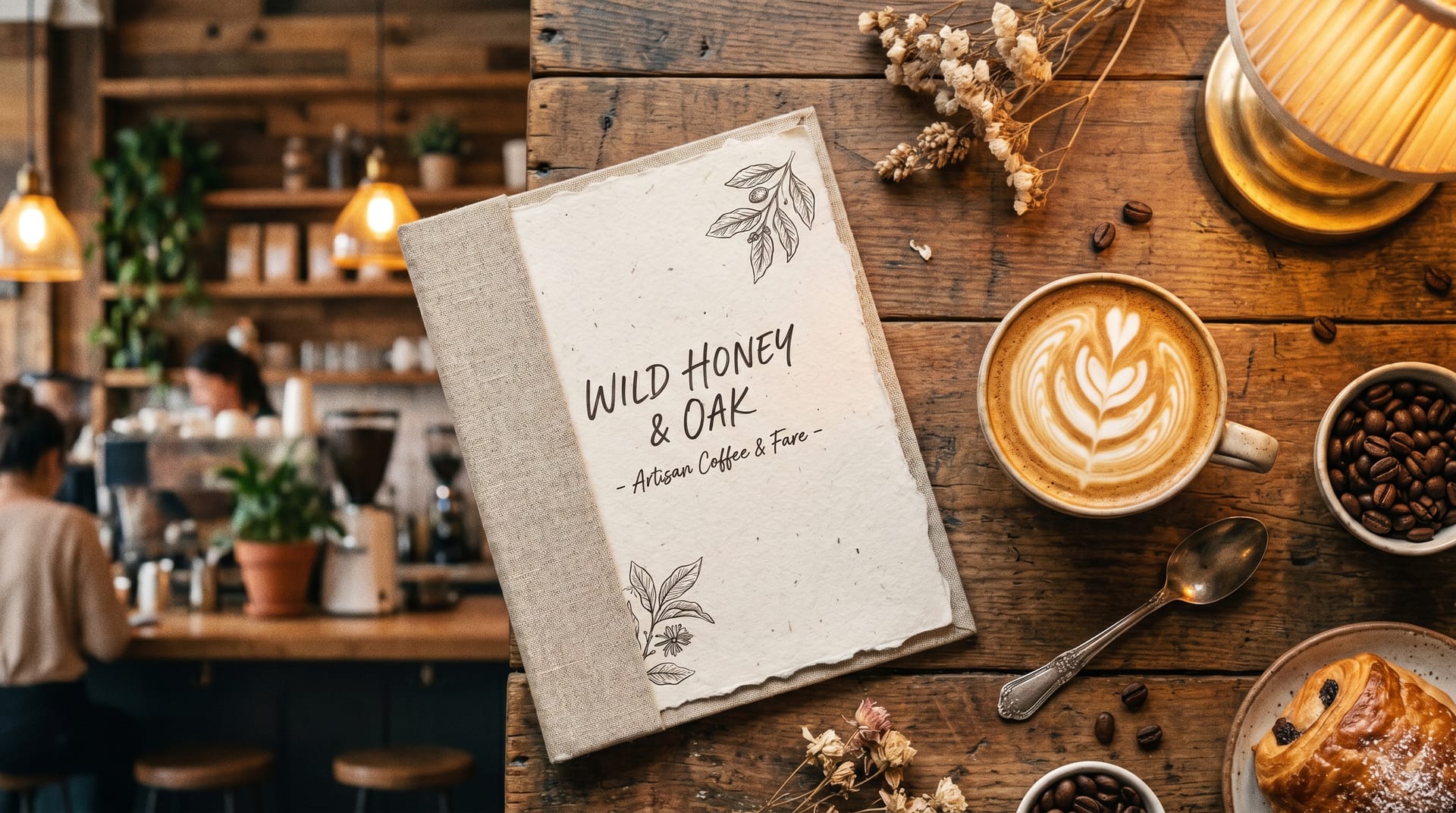
20 Creative Menu Design Ideas for Cafe Owners in 2026
TL;DR: Your cafe menu is your silent salesperson. The right menu design ideas for cafe businesses can increase average order value by 15-20%, reduce decision fatigue, and reinforce your brand identity. This guide covers 10 proven menu styles, psychology-backed layout strategies, seasonal themes, and how AI tools like NeoSpark can help you design a professional cafe menu in minutes---no design experience required.
Table of Contents
- Why Cafe Menu Design Matters
- Top 10 Cafe Menu Design Ideas
- Menu Psychology for Cafes
- AI Menu Design for Cafes
- Seasonal Menu Ideas
- Print vs Digital Menus
- Cafe Menu Design Case Studies
- Frequently Asked Questions
- Conclusion: 6 Key Takeaways
- Related Resources
Why Cafe Menu Design Matters
Your menu is often the first tactile interaction a customer has with your brand. Before they taste your espresso or bite into your croissant, they read your menu. A well-designed menu does far more than list items and prices---it guides decisions, tells your story, and directly impacts your bottom line.
Research from Cornell University’s Food and Brand Lab reveals that strategic menu design can increase profits by 10-15%. Another study by Gallup found that customers spend an average of 109 seconds reading a menu---and in that brief window, your design determines whether they order a $4 drip coffee or a $7 signature latte with a pastry upsell.
The Business Impact of Menu Design
| Design Factor | Impact on Business | Source |
|---|---|---|
| Strategic item placement | +15% higher average order value | Cornell University, 2024 |
| Descriptive menu language | +27% increase in item sales | Journal of Hospitality Research |
| High-quality food photography | +30% impulse purchases | National Restaurant Association |
| Clean, uncluttered layout | -40% customer decision time | Gallup Consumer Study |
| Seasonal menu updates | +22% customer retention | Toast Industry Report 2025 |
For cafe owners, the stakes are particularly high. Unlike full-service restaurants where servers can guide choices, cafe customers often decide independently at the counter. Your menu must do the selling for you.
Top 10 Cafe Menu Design Ideas
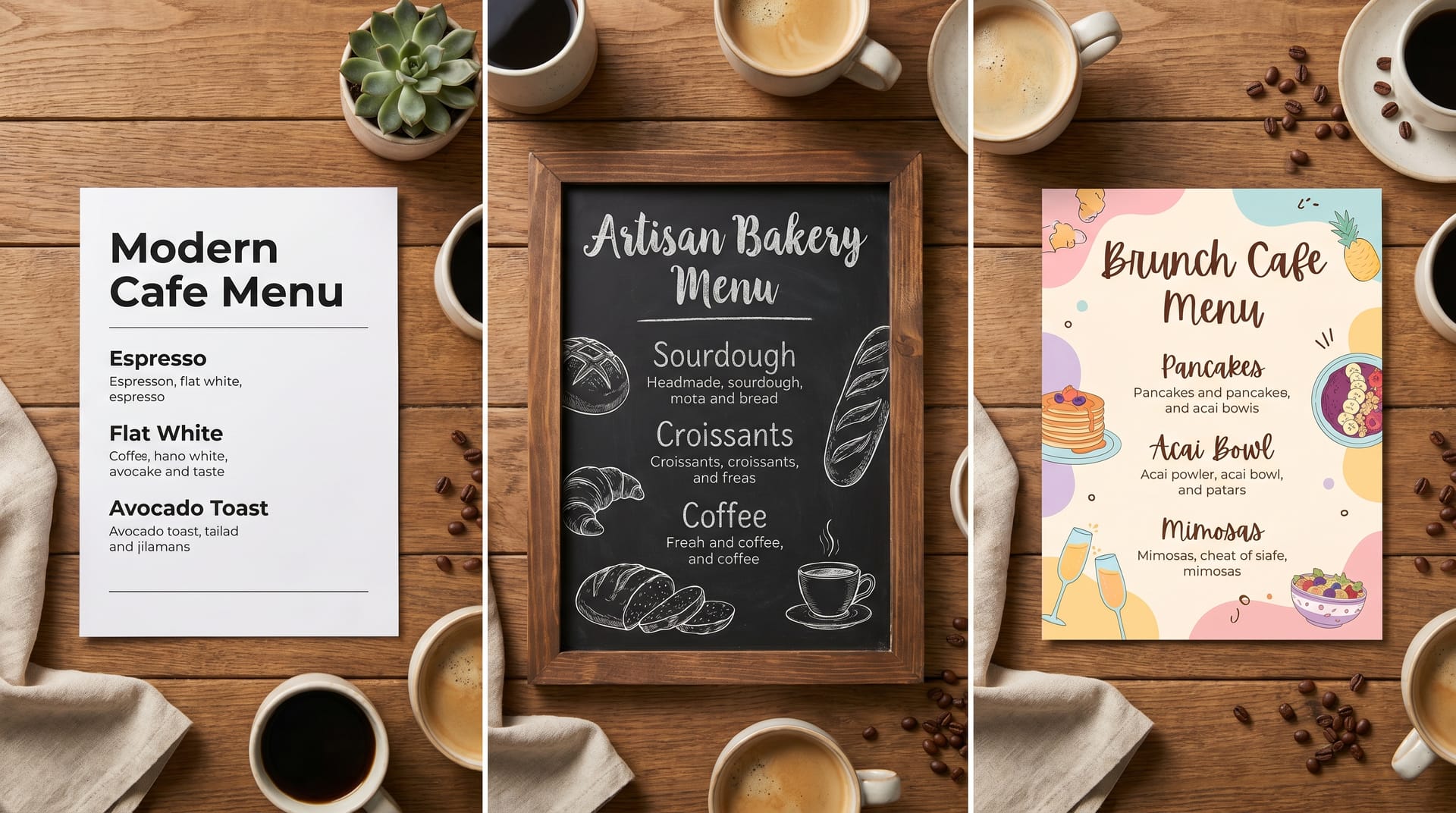
1. Minimalist Modern Menu
The minimalist approach strips away everything non-essential, letting your offerings speak for themselves. Think generous white space, a single elegant typeface, and perhaps one accent color that matches your brand.
Best for: Third-wave coffee shops, Scandinavian-inspired cafes, contemporary urban spaces.
Design tips:
- Use a maximum of two font weights
- Align all text to a consistent grid
- Remove dollar signs to reduce price sensitivity
- Limit the menu to 20-25 items to avoid overwhelm
Example layout: A single-column menu with categories (Espresso, Pour Over, Tea, Pastries) separated by subtle horizontal rules. Each item has a name, one-line description, and price---nothing more.
2. Chalkboard Style Menu
The chalkboard aesthetic evokes warmth, craftsmanship, and daily freshness. Even if you print on paper or display digitally, the hand-lettered chalkboard look signals that your offerings change with the seasons.
Best for: Neighborhood cafes, artisan bakeries, French-style patisseries.
Design tips:
- Use chalk-style fonts like “Permanent Marker” or “Caveat”
- Add subtle chalk dust textures in the background
- Include hand-drawn illustrations of coffee cups or pastries
- Leave visual “space” for daily specials written in a different style
3. Vintage & Retro Menu
Nostalgia sells. A vintage menu design with art deco borders, sepia tones, or mid-century modern typography transports customers to another era---and creates an Instagram-worthy moment.
Best for: Historic buildings, themed cafes, establishments targeting customers 35+.
Design tips:
- Source authentic vintage typefaces from the era you’re referencing
- Use aged paper textures or cream backgrounds instead of pure white
- Incorporate period-appropriate illustrations or etchings
- Consider die-cut edges or rounded corners for an authentic feel
4. Illustrated & Hand-Drawn Menu
Custom illustrations transform a functional menu into a piece of art. Whether it’s watercolor pastries, ink-drawn coffee equipment, or whimsical character art, illustrations show personality and care.
Best for: Boutique cafes, family-owned shops, brands with a playful or artistic identity.
Design tips:
- Commission a local artist for unique, location-specific illustrations
- Keep illustration style consistent throughout (all watercolor, or all line art)
- Use illustrations to highlight signature items, not every single offering
- Ensure illustrations don’t compete with readability
5. Photo-Based Menu
High-quality food photography triggers appetite and reduces uncertainty. When customers see a perfectly frothed latte or flaky croissant, they’re more likely to order it.
Best for: Fast-casual cafes, chains with consistent presentation, establishments with photogenic offerings.
Design tips:
- Invest in professional photography with consistent lighting and styling
- Use a grid layout with square or circular image crops
- Keep photos to 30-40% of the menu surface to maintain balance
- Update photos seasonally to reflect current offerings
6. Typography-Driven Menu
When typography itself becomes the design element, you create visual interest without relying on images. Bold headlines, oversized category names, and creative font pairings make a strong statement.
Best for: Design-forward cafes, urban concepts, establishments targeting younger demographics.
Design tips:
- Pair a bold display font for headers with a highly readable body font
- Use scale contrast---make category names 3-4x larger than item names
- Experiment with vertical text, rotated elements, or text as background patterns
- Ensure readability isn’t sacrificed for visual impact
7. Grid & Modular Menu
A modular grid system organizes information into clean, scannable blocks. This approach works exceptionally well for cafes with extensive offerings or multiple drink sizes and customization options.
Best for: Large-format menus, cafes with many customization options, establishments using digital displays.
Design tips:
- Use consistent spacing between modules (8px or 16px grids work well)
- Align prices consistently---either all right-aligned or in a dedicated column
- Use color coding for categories (green for tea, brown for coffee, etc.)
- Consider icons for dietary indicators (vegan, gluten-free, etc.)
8. Single-Page Folded Menu
Sometimes constraints breed creativity. A single-page menu that folds into thirds or quarters forces you to prioritize your best offerings and creates a tactile, booklet-like experience.
Best for: Counter-service cafes, takeout-focused establishments, budget-conscious operations.
Design tips:
- Put your highest-margin items on the front panel
- Use the inside panels for your full offerings
- Reserve the back panel for your story, hours, and contact information
- Choose heavier paper stock (at least 100lb cover) for durability
9. Storytelling Menu
Every item has an origin story---the Ethiopian single-origin beans, the family pastry recipe, the local farm that supplies your milk. A storytelling menu weaves these narratives into the design.
Best for: Specialty coffee shops, farm-to-table cafes, mission-driven brands.
Design tips:
- Dedicate sidebar space to origin stories for signature items
- Include small portraits of producers or suppliers
- Use a narrative voice in descriptions (“Our founder discovered this roast in a Lisbon alleyway…”)
- Consider a “coffee passport” format where customers collect stamps
10. Interactive & Digital Menu
Digital menus displayed on tablets, QR-code-accessed mobile pages, or overhead screens offer dynamic possibilities: real-time updates, animated transitions, and personalized recommendations.
Best for: Tech-forward cafes, high-volume establishments, brands with frequently changing offerings.
Design tips:
- Ensure load times under 2 seconds for mobile-accessed menus
- Use high-contrast designs readable in bright cafe lighting
- Include subtle animations for category transitions
- Always offer an accessible, text-only alternative
Menu Psychology for Cafes
Understanding how customers read menus allows you to design with intention. Three core psychological principles should inform every menu design decision.
The Golden Triangle
Eye-tracking studies reveal that customers’ eyes first move to the center of a menu, then to the top-right, then to the top-left---forming a “golden triangle” of visual attention. Place your highest-margin items in these zones.
For single-page cafe menus, position your signature latte or seasonal specialty in the center. For multi-page menus, the top-right of the right-hand page receives the most attention.
Price Anchoring
Price anchoring uses strategically placed high-priced items to make other items feel more reasonable. List your premium single-origin pour-over at $8 near the top of your coffee section, and your $5.50 signature latte suddenly feels like a smart middle-ground choice.
Additional anchoring techniques:
- Remove dollar signs (“6” instead of “$6.00”) to reduce price pain
- Avoid leader dots connecting items to prices---they draw the eye straight to cost
- Nest prices within descriptions rather than in a separate column
Descriptive Language
Researchers at Cornell found that descriptive menu labels increase sales by 27% compared to plain names. “Velvety Madagascar Vanilla Latte” outperforms “Vanilla Latte” every time.
Effective descriptive categories include:
- Sensory words: velvety, crisp, smoky, buttery, aromatic
- Origin indicators: Ethiopian, Sumatran, Colombian, French
- Preparation methods: slow-steeped, hand-whisked, oven-warmed
- Provenance stories: grandmother’s recipe, founder’s favorite, local farm
Avoid overloading descriptions---one to two evocative adjectives per item is sufficient.
AI Menu Design for Cafes
Creating a professional cafe menu no longer requires hiring a graphic designer or learning complex software. AI-powered design tools like NeoSpark enable cafe owners to generate polished, on-brand menus in minutes.
How NeoSpark Transforms Cafe Menu Design
1. Brand-Aware Generation NeoSpark analyzes your existing brand assets---logo, color palette, interior photos---and generates menu designs that feel native to your space. Upload a photo of your cafe’s interior, and the AI suggests complementary color schemes and typography.
2. Industry-Optimized Templates Unlike generic design tools, NeoSpark’s templates are built specifically for hospitality. Coffee categories, dietary icons, and price formatting come pre-configured.
3. Content-Aware Layout Simply paste your menu items, and NeoSpark automatically optimizes hierarchy, spacing, and flow. The AI understands that “Espresso” should precede “Specialty Drinks” and that prices should align without manual adjustment.
4. Seasonal Variations in One Click Update your menu for summer iced drinks or winter warmers with a single prompt. NeoSpark preserves your core design while swapping colors, imagery, and featured items.
5. Export for Any Format Generate print-ready PDFs at 300 DPI, web-optimized images for Instagram, or digital display formats for in-house screens---all from the same design file.
Getting Started with NeoSpark
- Upload your brand assets (logo, colors, reference photos)
- Select “Cafe Menu” from the hospitality template library
- Input your menu items via text upload or manual entry
- Choose a style direction (minimalist, vintage, illustrated, etc.)
- Generate variations and refine your favorite
- Export in your required format
Most cafe owners complete their first menu design in under 30 minutes---compared to the 2-3 week turnaround of traditional design agencies.
Seasonal Menu Ideas
Seasonal menu updates keep customers engaged and give regulars a reason to return. Each season offers distinct design opportunities.
Spring Menu Themes
Visual direction: Soft pastels, botanical illustrations, fresh green accents, floral patterns.
Featured items: Lavender honey lattes, strawberry matcha, lemon ricotta scones, cold brew flights.
Design approach: Use watercolor florals as subtle background elements. Incorporate light, airy typography. Consider a “Spring Bloom” limited section that stands out with a distinct background color.
Summer Menu Themes
Visual direction: Bright, saturated colors, tropical motifs, ice cube textures, beach photography.
Featured items: Iced cascara tea, coconut cold brew, affogato bar, fruit tartines.
Design approach: Split the menu into “Hot” and “Iced” sections with temperature-appropriate color coding (warm reds vs. cool blues). Use photography of condensation-covered glasses to trigger thirst.
Fall Menu Themes
Visual direction: Warm earth tones, wood grain textures, hand-lettered scripts, leaf motifs.
Featured items: Pumpkin spice (done differently), maple oat lattes, apple cider drinks, spiced chai.
Design approach: This is the season for storytelling menus. Share the origin of your spice blend or the local orchard supplying your apple cider. Use kraft paper textures and burnt orange accents.
Winter Menu Themes
Visual direction: Deep jewel tones, metallic accents, cozy textures, snowflake or evergreen motifs.
Featured items: Peppermint mochas, gingerbread lattes, hot chocolate flights, cinnamon rolls.
Design approach: Create a “Winter Warmers” featured section with a distinct background color. Use script fonts for a festive feel. Consider a “12 Days of Coffee” countdown format for holiday engagement.
Print vs Digital Menus
The choice between print and digital menus isn’t binary---many successful cafes use both. Here’s how they compare.
| Factor | Print Menus | Digital Menus |
|---|---|---|
| Initial Cost | $200-$800 for design + printing | $0-$500 for setup (tablet/screen costs vary) |
| Update Speed | Slow---requires reprinting | Instant---push updates in real-time |
| Tactile Experience | High---paper texture, weight, finish | None---screen-based interaction |
| Customer Engagement | Moderate---static visual experience | High---animations, interactivity, photos |
| Accessibility | Universal---no device required | Variable---requires smartphone or shared device |
| Environmental Impact | Higher---paper, ink, reprinting | Lower---no physical waste |
| Data Collection | None---no analytics possible | Rich---track views, time spent, popular items |
| Best Use Case | Table service, counter display, brand keepsake | Frequently changing menus, high-volume service |
Our recommendation: Use printed menus for your core offerings and table displays, supplemented by digital boards or QR codes for daily specials, seasonal items, and detailed nutritional information.
Cafe Menu Design Case Studies
Case Study 1: Morning Ritual Coffee, Portland
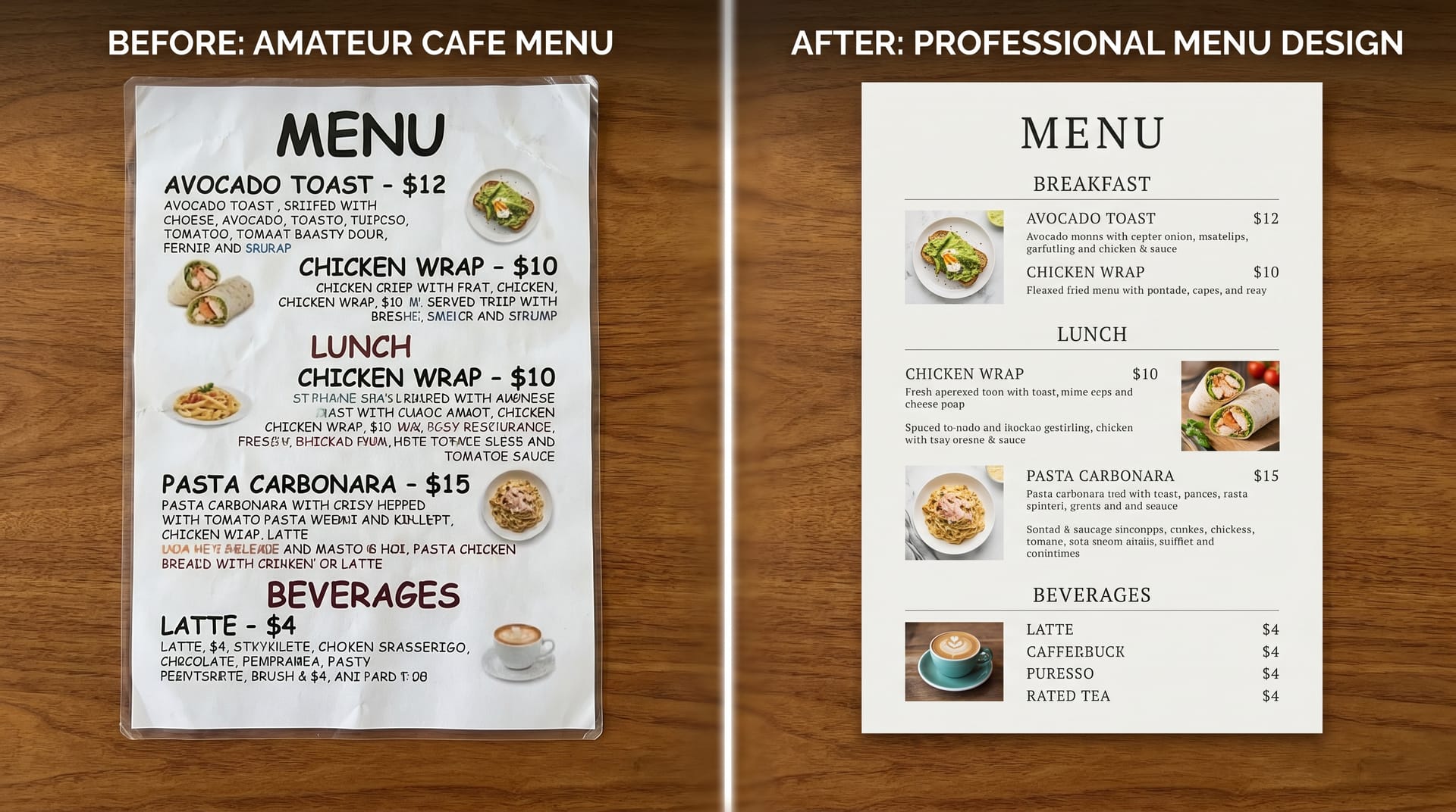
The Challenge: Morning Ritual, a third-wave coffee shop in Portland’s Alberta Arts District, had a menu that hadn’t been updated in four years. It was a single sheet of laminated paper with 47 items in 10-point Arial font. Customers complained about decision fatigue, and baristas spent excessive time explaining the menu.
The Redesign: Working with NeoSpark, owner Sarah Chen implemented a minimalist two-panel menu design. The menu was reduced to 24 carefully curated items organized into four clear categories: Espresso Classics, Signature Drinks, Pour Over & Tea, and Food.
Key Changes:
- Removed dollar signs and leader dots
- Added one-sentence descriptions using sensory language
- Placed the $7.50 “Ritual Flight” (three single-origin samples) in the golden triangle position
- Used a warm cream background with forest green typography to match the cafe’s interior
The Results:
- Average order value increased from $6.20 to $8.40 (35% increase)
- Customer decision time at the counter decreased by 25 seconds
- The “Ritual Flight” became the top-selling item within two weeks
- Instagram tags featuring the menu increased 400%
“I didn’t realize how much our old menu was costing us until we redesigned it. The new menu doesn’t just look better---it sells better.” ---Sarah Chen, Owner
Case Study 2: Le Petit Croissant, Lyon-Inspired Bakery, Chicago
The Challenge: Le Petit Croissant opened with a beautiful French-inspired interior but a generic, computer-printed menu that clashed with the aesthetic. Owner Marc Dubois wanted a menu that felt like it belonged in a Parisian patisserie.
The Redesign: Using NeoSpark’s vintage template library, Marc created a menu with art nouveau borders, a cream and burgundy color palette, and custom watercolor illustrations of the bakery’s signature items. The menu was printed on textured, cream-colored cardstock with deckle edges.
Key Changes:
- French item names with English translations in elegant parentheses
- Hand-lettered style typography for category headers
- Small illustrations of the Eiffel Tower and wheat sheaves as decorative elements
- A “Chef’s Selection” box highlighting the daily special
The Results:
- Customers frequently asked to keep menus as souvenirs (solved by selling branded menu cards)
- The bakery was featured in three local “most Instagrammable cafes” lists
- Weekend foot traffic increased 28% within the first month
- Average transaction value rose 18% as customers ordered more pastry pairings
“Our menu became part of the experience. People don’t just read it---they photograph it, share it, and keep it. That’s marketing you can’t buy.” ---Marc Dubois, Owner
Frequently Asked Questions
How often should I update my cafe menu design?
You should refresh your menu design every 12-18 months to prevent visual fatigue. However, update content seasonally---rotate featured items every 3-4 months to match seasonal ingredients and customer cravings. Minor tweaks (new items, price adjustments) can happen monthly.
What is the ideal number of items on a cafe menu?
Research suggests 20-30 items is the sweet spot for counter-service cafes. Fewer than 15 feels limited; more than 35 triggers decision paralysis. If you have extensive offerings, use a “core menu” for daily items and a rotating “specials” board or insert.
Should I include prices on my cafe menu?
Yes, always include prices---omitting them creates suspicion and discomfort. However, design them strategically: remove dollar signs, avoid leader dots, and nest prices within item descriptions rather than in a separate column. This reduces price sensitivity while maintaining transparency.
What size should a printed cafe menu be?
For counter-service cafes, 8.5” x 11” (letter size) or A4 works well for single-page menus. For table-service cafes or more extensive offerings, consider 8.5” x 14” (legal size) folded into a tri-fold, or 11” x 17” folded in half. Ensure text is readable from 2-3 feet away.
How do I make my menu accessible to all customers?
Use high contrast between text and background (minimum 4.5:1 ratio per WCAG guidelines). Choose readable fonts at 11pt minimum for body text. Include dietary icons for common restrictions (vegan, gluten-free, nut-free). Offer large-print versions upon request, and ensure digital menus are screen-reader compatible.
Can I design a professional menu without graphic design experience?
Absolutely. AI-powered tools like NeoSpark are built specifically for non-designers. The platform handles typography, spacing, color theory, and hierarchy automatically. You simply input your content and preferences, and the AI generates professional options. Most cafe owners create their first menu in under 30 minutes.
What’s the most important element of cafe menu design?
Clarity trumps everything. A beautiful menu that customers can’t read or navigate quickly is a failed menu. Start with clear hierarchy, readable typography, and logical organization. Only then layer in visual flourishes, photography, or decorative elements.
Conclusion: 6 Key Takeaways
After exploring menu design ideas for cafe businesses across styles, psychology, and technology, here are the essential principles to apply:
-
Your menu is a sales tool, not just a list. Every placement decision should guide customers toward your highest-margin, most distinctive offerings.
-
Less is more. Limit your menu to 20-30 items, use descriptive but concise language, and embrace white space. Overwhelmed customers take longer to decide and spend less.
-
Design for the golden triangle. Place your priority items where eyes naturally land first: the center of the menu, then the top-right, then the top-left.
-
Seasonal updates drive retention. Customers return to see what’s new. Plan quarterly design refreshes that reflect seasonal ingredients, colors, and moods.
-
Match your menu to your brand. A mismatched menu creates cognitive dissonance. Your menu should feel like a natural extension of your space, your staff, and your story.
-
AI tools democratize professional design. Platforms like NeoSpark enable any cafe owner to create agency-quality menus without the agency timeline or budget.
The cafes that thrive in 2026 will treat their menus as living, strategic assets---not static documents. Start with one change from this guide, measure the impact, and iterate. Your menu is your most frequently viewed piece of marketing. Make it count.
Related Resources
- NeoSpark Menu Design Tool --- Create professional cafe menus in minutes with AI-powered templates
- Brand Identity Guide for Coffee Shops --- Build a cohesive brand from logo to packaging
- Social Media Templates for Cafes --- Instagram-ready templates for daily specials and promotions
- Color Psychology in Restaurant Design --- How color choices affect appetite and dwell time
- Typography Guide for Hospitality Brands --- Choose fonts that communicate your cafe’s personality
- Seasonal Marketing Calendar for Cafes --- Plan your year of promotions, menu updates, and campaigns
Ready to redesign your cafe menu? Try NeoSpark’s AI menu designer and create your first professional menu today---no design experience required.