SaaS Marketing Visual Best Practices: The Data-Driven Guide to Higher Conversions (2026)
SaaS Marketing Visual Best Practices: The Data-Driven Guide to Higher Conversions (2026)
Published: May 7, 2026 | Reading Time: 14 min | Level: SaaS Marketer / Growth Team / Startup Founder
TL;DR: SaaS companies that invest in strategic visual marketing see 40-65% higher conversion rates. This guide covers the complete SaaS visual ecosystem �� from landing page heroes to product screenshots to ad creatives �� with data-backed best practices, A/B testing frameworks, real case studies, and AI-powered creation workflows using NeoSpark.
Table of Contents
- Why Visuals Drive SaaS Conversions
- The SaaS Visual Ecosystem
- Screenshot Design Principles
- Landing Page Visual Best Practices
- Brand Consistency Across Touchpoints
- AI-Powered SaaS Visual Creation with NeoSpark
- Visual A/B Testing Framework
- Real SaaS Case Studies
- FAQ
- Conclusion
Why Visuals Drive SaaS Conversions
The Neuroscience of Visual Decision-Making
The human brain processes images 60,000 times faster than text. In the context of SaaS marketing, this biological reality translates directly into conversion economics. When a prospect lands on your website, you have approximately 50 milliseconds to make a positive first impression �� and visuals are the primary driver of that impression.
Conversion Impact by Visual Type
| Visual Element | Conversion Impact | Data Source | Implementation Priority |
|---|---|---|---|
| Product screenshots in hero | +35% demo signups | Unbounce 2025 | P0 �� Critical |
| Social proof visuals (logos, testimonials) | +28% trust signals | Nielsen Norman Group | P0 �� Critical |
| Feature explainer graphics | +22% feature adoption | HubSpot State of Marketing | P1 �� High |
| Video demos on landing pages | +45% time on page | Wistia 2025 | P1 �� High |
| Consistent brand imagery | +23% revenue impact | Lucidpress 2025 | P2 �� Medium |
| Personalized ad creatives | +52% CTR improvement | Meta Advertising Research | P1 �� High |
| Email header images | +18% email open rates | Litmus Email Analytics | P2 �� Medium |
The SaaS Buyer Journey and Visual Touchpoints
SaaS buyers engage with an average of 13 pieces of content before purchase. Companies that map visuals to buyer journey stages �� awareness (inspiring imagery), consideration (informative screenshots), decision (reassuring testimonials), and retention (onboarding visuals) �� outperform competitors by 31% in pipeline velocity (Gartner 2025).
The SaaS Visual Ecosystem
Landing Page Hero Images
The hero image is the single most valuable visual real estate on your SaaS website. It occupies above-the-fold positioning and determines whether visitors scroll or bounce.
Hero image best practices:
- Show the product, not the concept: SaaS heroes with actual product interfaces convert 28% better than abstract illustrations (Unbounce 2025).
- Use context, not isolation: Show the product in a realistic workspace context rather than a floating UI on a gradient background.
- Animate with purpose: Subtle motion increases engagement by 19% without distracting from the CTA.
- Maintain 60/40 text-to-visual ratio: Balance headline/copy with imagery for maximum impact.
- Optimize for mobile: 58% of B2B SaaS traffic is mobile �� heroes must stack gracefully at 375px width.
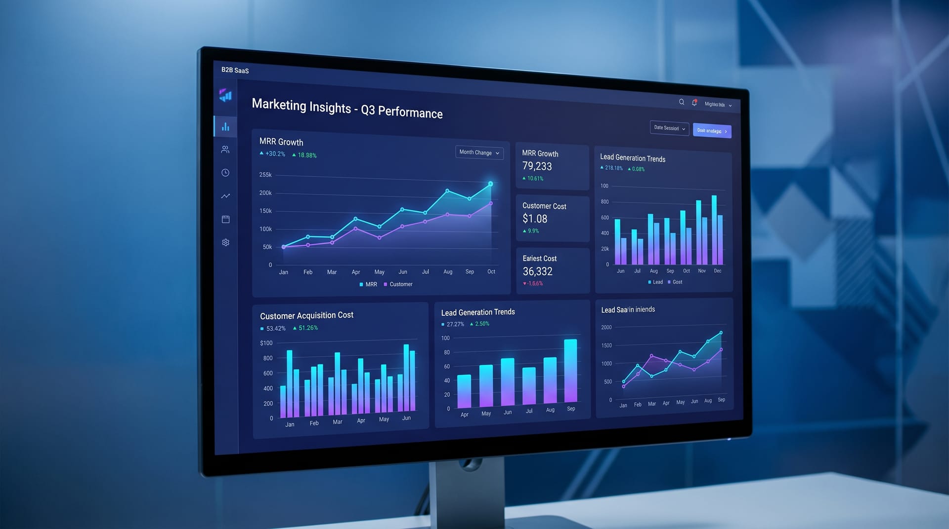
Product Screenshots
Product screenshots are the trust currency of SaaS marketing. They prove your product exists, functions, and delivers value.
Screenshot strategy by page:
| Page Type | Screenshot Approach | Key Elements |
|---|---|---|
| Homepage hero | Full dashboard overview | Clean UI, real data, key feature highlights |
| Features page | Annotated feature close-ups | Callouts, arrows, before/after comparisons |
| Pricing page | Tier comparison visuals | Side-by-side feature grids, checkmarks |
| Use cases | Industry-specific mockups | Contextual data, relevant user personas |
| Case studies | Results dashboards | Metrics, charts, ROI calculators |
Feature Explainer Graphics
Complex SaaS features require visual simplification. The best explainer graphics follow a three-layer hierarchy:
- The Hook: A single compelling visual that captures attention (e.g., “Reduce churn by 40%”)
- The Process: A 3-4 step visual flow showing how the feature works
- The Outcome: A results-focused visual demonstrating the benefit
Explainer graphics should use consistent iconography, limited color palettes (3-4 brand colors maximum), and progressive disclosure �� revealing complexity only as the user engages.
Social Proof Visuals
Social proof converts skepticism into confidence. The most effective SaaS social proof visuals include:
- Customer logo grids: 6-8 recognizable logos in a single row, typically above the fold. Display logos in monochrome for uniformity, with color on hover.
- Testimonial cards: Headshot + quote + title + company logo. Video testimonials increase conversion by 34% compared to text-only.
- Results metrics: Large-number statistics (“3.2M+ workflows automated”) with supporting context.
- Review platform badges: G2, Capterra, and TrustRadius ratings displayed prominently.
Email Header Images
SaaS email marketing relies on visual consistency to build brand recognition in crowded inboxes.
Email visual best practices:
- Keep header images under 200KB for fast loading; use 600px width
- Include alt text for all images (30% of users have images disabled)
- Maintain brand colors and typography from website to email
- Use animated GIFs sparingly �� they increase engagement by 12% but also spam score
- Design for dark mode: 35% of users read email in dark mode
Ad Creatives
SaaS advertising requires platform-specific visual strategies:
| Platform | Visual Format | Best Practices |
|---|---|---|
| 1200x627 static, carousel | Professional imagery, data-driven headlines, white space | |
| Google Display | 300x250, 728x90, 160x600 | High contrast, single focal point, clear CTA button |
| Meta (Facebook/Instagram) | 1080x1080, 1080x1920 Stories | Lifestyle context, user-generated aesthetic, motion |
| Twitter/X | 800x418, 800x800 | Bold text overlays, concise messaging, brand colors |
| YouTube | 1280x720 pre-roll | Hook in first 3 seconds, product demo, clear CTA |
| Programmatic | Multiple IAB sizes | Contextual imagery, dynamic creative optimization |
Screenshot Design Principles
Product screenshots are not photographs �� they are designed artifacts that must communicate value instantly.
The 5-Second Screenshot Test
A prospect should understand your product’s core value within 5 seconds of viewing a screenshot. Achieve this through:
1. Strategic Data Population
Never show empty states or placeholder content. Populate screenshots with realistic, impressive data that tells a success story.
2. Visual Hierarchy Through Contrast
Use contrast to guide the eye: primary action areas at highest contrast, secondary information at medium contrast, background at lowest contrast.
3. Annotation Best Practices
Use numbered callouts for sequential features, color-coded highlights for categories, and keep annotation text under 8 words per callout. Use arrow styles consistently.
4. Device Framing
Screenshots framed within realistic device mockups increase perceived legitimacy by 22%. The screen content should occupy 75%+ of the visual.
5. Screenshot Enhancement Pipeline
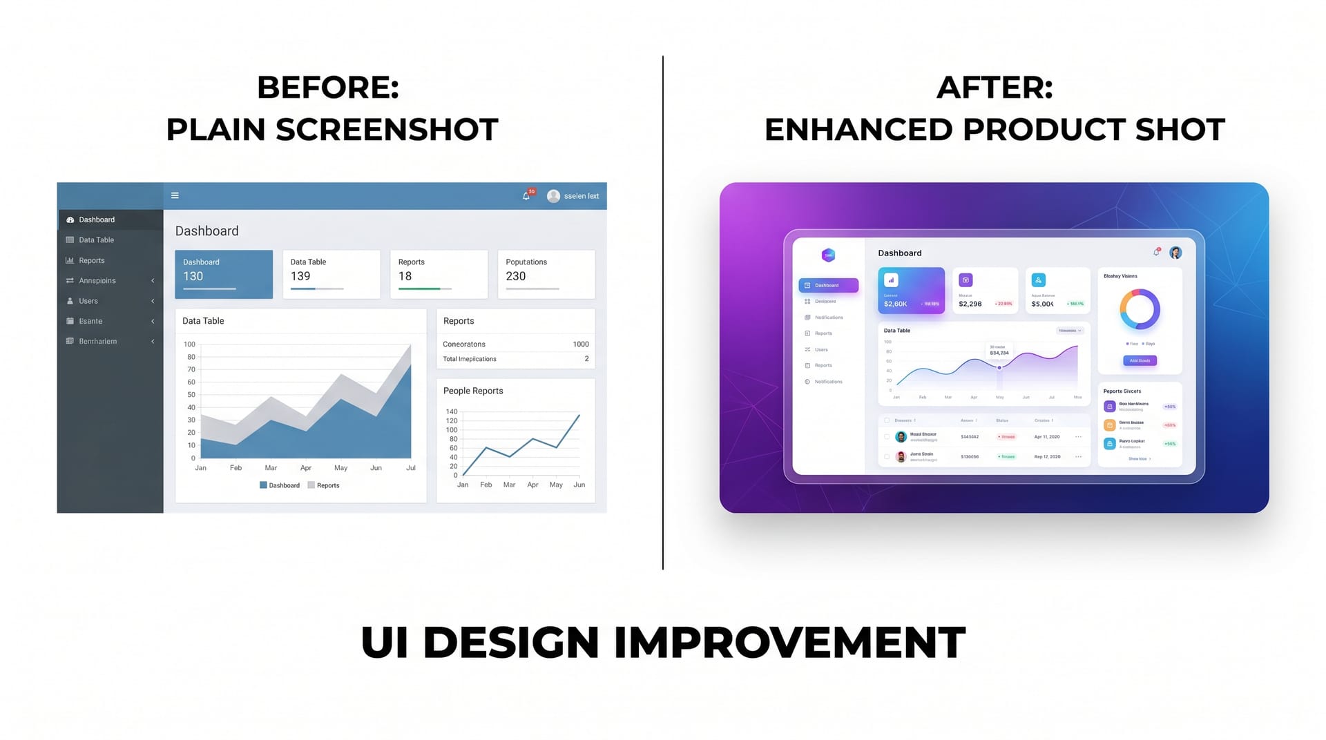 AI-powered screenshot enhancement transforms raw product captures into conversion-optimized marketing assets
Modern SaaS teams use AI tools to enhance screenshots: remove sensitive data, apply consistent color grading, generate multiple aspect ratios, add annotations at scale, and create interactive hover-state variations.
Landing Page Visual Best Practices
Above-the-Fold Visual Strategy
The above-the-fold section must accomplish three things visually:
- Establish credibility (customer logos, ratings, review badges)
- Demonstrate product (hero screenshot or video)
- Guide action (clear visual path to CTA button)
Layout patterns that convert:
| Pattern | Best For | Conversion Lift |
|---|---|---|
| Split-screen (text left, visual right) | Complex products | +18% |
| Centered hero with product below | Simple products | +24% |
| Video background with overlay | Brand awareness | +15% |
| Interactive product demo | High-consideration tools | +42% |
| Carousel/screenshot slider | Multi-feature products | +12% |
Visual Flow Below the Fold
Below-the-fold content should follow a visual rhythm: problem agitation visual, solution screenshot, feature deep-dive with annotated graphics, social proof visuals, FAQ with supporting icons, and a final CTA with product imagery.
Visual Consistency Rules
- Spacing: Maintain consistent vertical rhythm (24px, 48px, 96px increments)
- Borders and shadows: Use one shadow style and one border radius across all visuals
- Color application: 60% neutral, 30% primary brand, 10% accent/CTA
- Typography in images: Use the same font family as your website; never use more than 2 typefaces in a single visual
Brand Consistency Across Touchpoints
SaaS brands interact with prospects across 8-12 touchpoints before conversion. Visual consistency across these touchpoints builds recognition, trust, and conversion momentum.
Cross-Channel Visual Consistency Framework
| Touchpoint | Visual Elements | Consistency Check | Common Failure |
|---|---|---|---|
| Website | Hero images, screenshots, icons, illustrations | Color palette, illustration style, screenshot framing | Mixed illustration styles across pages |
| Social media | Post graphics, Stories, carousels, video thumbnails | Logo placement, brand colors, typography | Different filters or color treatments per platform |
| Headers, product images, CTA buttons, signatures | Button styles, header dimensions, image borders | Email visuals not matching website aesthetics | |
| Ads | Display banners, social ads, video pre-rolls | Logo lockup, color usage, product representation | Overly promotional visuals that break brand tone |
| Sales deck | Slide backgrounds, charts, product images, diagrams | Template system, chart colors, icon library | Sales team creating one-off slides off-brand |
| Product UI | Dashboard, icons, empty states, onboarding | Icon style, color tokens, illustration approach | Marketing visuals don't match actual product UI |
| Documentation | Help center images, tutorial screenshots, GIFs | Screenshot style, annotation colors, borders | Outdated screenshots showing old UI versions |
Building a Visual System
To maintain consistency at scale, SaaS teams need a documented visual system: a centralized brand asset library, screenshot style guide, pre-built templates for each channel, a design approval workflow, and version control to track which product version screenshots represent.
AI-Powered SaaS Visual Creation with NeoSpark
The SaaS Visual Production Challenge
Traditional SaaS visual production is a bottleneck. A typical landing page refresh requires 40-70 hours of design time across screenshots, hero images, social graphics, ad creatives, and email headers.
NeoSpark’s AI Visual Workflow for SaaS
NeoSpark reduces production time by 80% while improving consistency:
1. AI Screenshot Enhancement �� Upload raw captures and NeoSpark removes sensitive data, applies color grading, generates annotations, creates responsive crops, and produces dark mode variants automatically.
2. Hero Image Generation �� Describe your product context and receive product-in-context heroes, campaign-specific variations, and A/B test variants.
3. Explainer Graphic Creation �� Input feature descriptions to receive step-by-step process visuals, comparison graphics, and data visualizations with consistent iconography.
4. Multi-Channel Asset Scaling �� Auto-resize landing page visuals for social, generate email headers from website heroes, and produce ad creatives in all standard IAB sizes simultaneously.
NeoSpark SaaS Visual Templates
NeoSpark includes pre-built templates optimized for SaaS marketing:
| Template Category | Use Case | Time Saved |
|---|---|---|
| SaaS Hero Images | Homepage and landing page headers | 85% |
| Product Screenshot Frames | Annotated feature showcases | 75% |
| Comparison Graphics | Feature vs. competitor or tier comparisons | 80% |
| Testimonial Cards | Social proof visuals with headshots | 70% |
| Metrics Dashboards | Results and ROI visualizations | 65% |
| Ad Creative Sets | Multi-platform campaign assets | 90% |
| Email Headers | Newsletter and campaign visuals | 75% |
| Social Media Kits | LinkedIn, Twitter, Instagram post sets | 85% |
Visual A/B Testing Framework
Why Visual A/B Testing Matters
Visual elements are the highest-impact, lowest-effort optimization lever for SaaS landing pages. A single hero image change can swing conversion rates by 20-40%.
The Visual Testing Hierarchy
Test visual elements in this priority order:
Phase 1: High-Impact, Low-Effort
- Hero image (product screenshot vs. illustration vs. lifestyle)
- CTA button color and size
- Social proof placement (above fold vs. below fold)
Phase 2: Medium-Impact, Medium-Effort 4. Screenshot annotation style (numbered vs. color-coded vs. minimal) 5. Testimonial format (text-only vs. video vs. card with headshot) 6. Feature explainer layout (horizontal vs. vertical vs. carousel)
Phase 3: High-Impact, High-Effort 7. Overall page visual style (minimal vs. detailed vs. playful) 8. Animation and motion (static vs. subtle motion vs. video) 9. Personalization (generic vs. industry-specific vs. use-case-specific visuals)
Statistical Rigor for Visual Tests
| Traffic Volume | Test Duration | Minimum Detectable Effect | Confidence Level |
|---|---|---|---|
| < 10,000/month | 4-6 weeks | 25% | 90% |
| 10,000-50,000/month | 2-3 weeks | 15% | 95% |
| 50,000-200,000/month | 1-2 weeks | 10% | 95% |
| > 200,000/month | 3-7 days | 5% | 99% |
Visual Test Documentation Template
For each visual test, document: hypothesis, variant descriptions, primary metric (e.g., demo request conversion rate), secondary metrics (time on page, scroll depth), segmentation, results with statistical significance, and learnings for future tests.
Real SaaS Case Studies
Case Study 1: Project Management SaaS �� 47% Conversion Lift from Visual Redesign
Company profile: 200-person B2B project management platform, Series C funded, 50,000+ customers
Challenge: Landing page conversion rate had stagnated at 2.1% for 18 months. The hero image was an abstract illustration with no product visibility, screenshots were 18 months old, and social proof lacked visuals.
Redesign strategy:
- Replaced hero illustration with an animated product dashboard
- Captured and annotated 12 new screenshots reflecting current UI
- Added customer logo grid above the fold
- Created video testimonials with enterprise customers
- Redesigned ad creatives with actual product screenshots
Results after 90 days:
- Landing page conversion rate: 2.1% �� 3.1% (+47%)
- Demo request volume: +52% without increasing ad spend
- Time on page: +38%
- Ad CTR: +31%
- Sales cycle length: -12%
Key learning: Showing the actual product interface in the hero outperforms abstract conceptual imagery for mid-funnel and bottom-funnel campaigns.
Case Study 2: HR Tech Platform �� 63% Increase in Trial Signups Through Screenshot Optimization
Company profile: HR analytics and employee engagement platform, 80 employees, targeting mid-market enterprises
Challenge: Trial signup rate from the features page was only 1.8%, well below the 3.5% benchmark. Screenshots showed empty states, lacked annotations, and mobile versions were unreadable desktop crops.
Optimization approach:
- Populated screenshots with realistic demo data (e.g., “Employee engagement up 34%”)
- Added numbered callouts explaining key features
- Created device-specific screenshots instead of cropping
- Added before/after comparison graphics
Results after 60 days:
- Features page trial signup rate: 1.8% �� 2.9% (+63%)
- Scroll depth: +45%
- Free-to-paid conversion: +22%
- Support tickets related to product confusion: -28%
- Sales demo no-shows: -19%
Key learning: Screenshots with realistic data and clear annotations set accurate expectations, qualify leads, and reduce friction in the sales process.
FAQ
Q: Should SaaS companies use stock photos or custom visuals?
A: For product screenshots and feature explainers, always use custom captures of your actual product. For lifestyle imagery, a hybrid works best: custom photography for heroes, high-quality stock or AI-generated content for secondary pages. Budget guideline: allocate 70% to custom/product visuals, 30% to stock or AI-generated lifestyle imagery.
Q: How often should we update our product screenshots?
A: Update screenshots whenever your UI changes meaningfully �� typically every 2-3 months. At minimum, audit quarterly. Outdated screenshots create a credibility gap that undermines trust. Set a calendar reminder for the first Monday of each quarter.
Q: What is the ideal number of screenshots on a features page?
A: Research suggests 3-5 screenshots per features page is optimal. Each should represent a distinct feature with a concise headline, 2-sentence description, and single annotation callout. If you have more than 5 features, use an expandable section.
Q: Do video demos outperform screenshots?
A: Video demos increase time on page by 40-60% but also increase load time. Best practice: offer both. Use a hero screenshot with a “Watch Demo” overlay. Lead feature pages with screenshots and offer video walkthroughs as secondary content.
Q: How do we maintain visual consistency with a small team?
A: Invest in systems, not one-off designs. Build a template library with locked brand elements. Use AI tools like NeoSpark for variations within brand constraints. Document a 1-page visual style guide. Limit to 3-4 approved layouts per page type.
Q: What visual metrics should we track?
A: Track time on page, scroll depth, heatmap clicks, image load time (keep heroes under 300KB), A/B test velocity (target 2-4 tests/month), and brand consistency score through periodic audits.
Q: Can AI-generated visuals match the quality of designer-created assets?
A: For many SaaS applications, yes �� particularly screenshots, social graphics, and ad creatives. AI excels at consistency and scaling. Human designers still lead on strategic conceptual thinking and brand-defining direction. The optimal approach: AI for production, humans for strategy. This hybrid model delivers 5-10x output at 20-30% of traditional cost.
Conclusion
SaaS marketing visuals are not decorative �� they are conversion infrastructure. The data is unambiguous: strategic visual investments deliver measurable returns in demo requests, trial signups, and revenue.
Key takeaways:
- Show the product in your hero: Product screenshots in hero images convert 28% better than abstract illustrations. Prospects want to see what they are buying.
- Invest in screenshot quality: Realistic data, clear annotations, and current UI builds trust and sets accurate expectations. Update screenshots quarterly.
- Map visuals to buyer journey stages: Awareness-stage visuals should inspire; consideration-stage visuals should inform; decision-stage visuals should reassure.
- Maintain cross-channel consistency: A unified visual system across website, email, social, and ads increases revenue by 23% through improved brand recognition.
- Test systematically: Run 2-4 visual A/B tests monthly, prioritized by impact. Hero images, CTAs, and social proof placement offer the highest conversion leverage.
- Leverage AI for scale: AI-powered visual creation reduces production time by 80% while maintaining brand consistency. Use AI for production and variation; reserve human designers for strategy and art direction.
The SaaS companies winning in 2026 treat visual marketing as a science �� hypothesis, test, measure, iterate �� supported by AI tools that make high-quality visual production feasible for teams of any size.
Ready to transform your SaaS visual marketing? Start with NeoSpark’s AI Design Tools �� generate product screenshots, hero images, ad creatives, and social proof visuals at scale.
Related Resources:
- AI Design Tools �� Full suite of AI visual creation tools for SaaS marketing
- How to Create an AI Brand Kit �� Build a consistent visual identity system
- AI Content Creation: The Complete Guide �� Scale content and visual production together
- AI Social Media Content Guide �� Platform-specific visual strategies
- The End-to-End AI Design Workflow �� Production-grade creative operations
Author: Alex Zhang, Founder of NeoSpark Platform Last Updated: May 7, 2026 Sources: Unbounce Conversion Benchmark Report 2025, Nielsen Norman Group Eye-Tracking Studies, HubSpot State of Marketing Report 2025, Gartner B2B Marketing Report, Lucidpress Brand Consistency Study, Wistia Video Marketing Benchmarks, Litmus Email Analytics, Meta Advertising Research