AI Poster Generator.
From Brief to Poster Art
Describe the poster you need and generate the artwork in seconds. This page covers what the tool does well, where you still need a design tool, and the formats that actually matter.
What an AI poster generator does, precisely
A poster is two things stacked on top of each other: the artwork, and the typography that carries the title, the date, the price, or the call to action. An AI poster generator produces the first of those, and it does it extremely well. It does not reliably produce the second, and any tool claiming otherwise is describing something you will not want to ship.
That distinction is worth stating at the top because it is the single most common wrong expectation. People generate a beautiful image, ask for the title in the corner, get back garbled letterforms that look almost right, and conclude the tool is broken. It is not broken. Image generation is trained on how things look, not on how type is set, and rendering clean letterforms is a different problem.
So the honest workflow is: generate the artwork here, in seconds and in as many variations as you want, then set your text in whatever design tool you already use. That two-step process is faster than starting from a blank canvas, and it is where nearly all the value sits.
Generate a poster now
Free to try, no account needed for your first generations. Describe the artwork you want — leave space in the composition for your title, and add the type afterwards.
Tip: Press Ctrl+Enter (or Cmd+Enter) to generate instantly. Free generations remaining: 3.
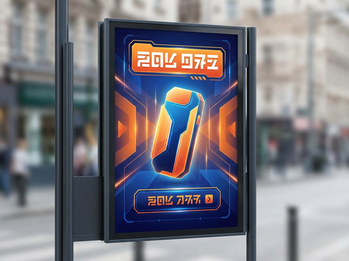
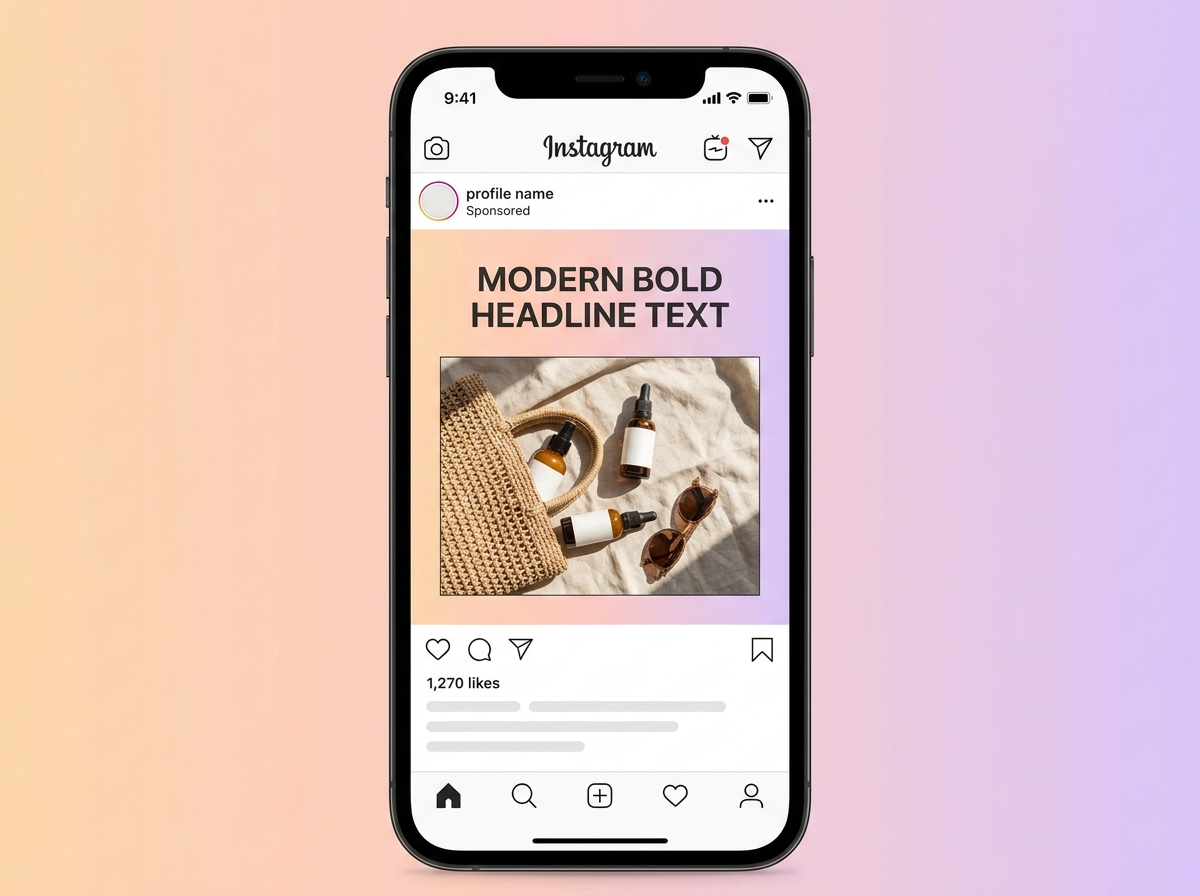
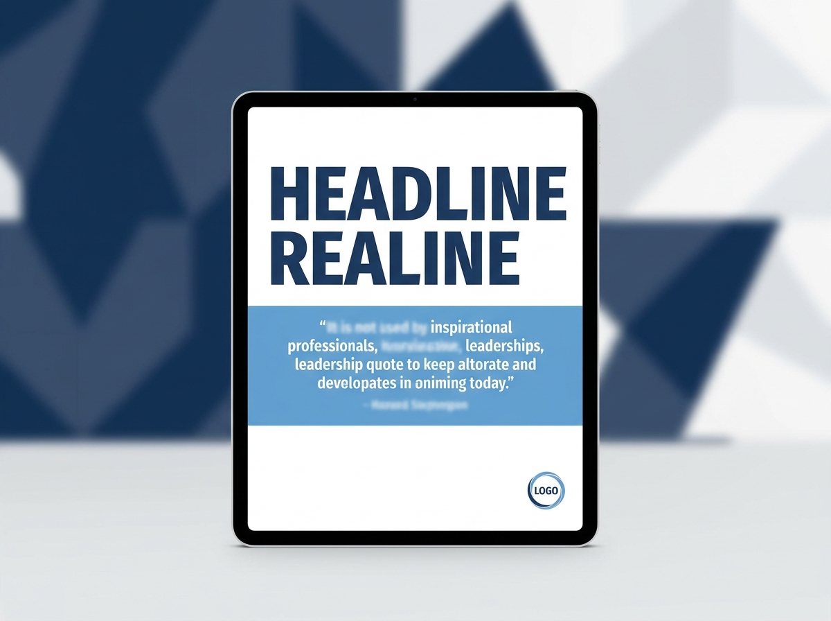
Real output from NeoSpark
These are actual generated results, not mockups. The first is a poster-format advertisement; the other three are social-post formats produced by the same engine, included because they show how the artwork holds up at feed sizes.

What makes a poster work as a poster
A poster has one job and a hostile viewing condition. It is seen at a distance, at speed, often at thumbnail size on a phone, and it has to land one idea before the viewer has decided whether to keep looking. Everything in the composition should serve that single idea.
The design principles are old and they have not changed because the medium did. One focal point, not three competing ones. Legibility at thumbnail size — if you cannot tell what the poster is about when it is 200 pixels wide, the composition is too busy, however good it looks full-screen. A clear hierarchy between the image and the text, which in practice means deciding where the type goes before you generate, so you can ask for space in that region.
The fourth principle is the one generators can help with most: a deliberate palette. A restricted palette of two or three colours reads as designed and holds up when printed cheaply. A generator will happily give you forty colours; asking for three is a decision that improves the result.
None of this is decoration. A poster whose focal point is buried under visual noise fails at exactly the moment it needed to work, and no amount of rendering quality rescues it.
Poster formats and what each one is for
Pick the format before you generate, because the proportions change the composition. A 2:3 portrait gives you vertical room for a title block; a square forces the subject into the middle.
| Format | Proportion | Typical use |
|---|---|---|
| Tall poster | 2:3 portrait | The classic printed poster. The most room for a title and the format most poster art is composed for. |
| Social portrait | 4:5 | Feed placements that allow the tallest image. Takes more vertical space in a scroll than a square. |
| Square | 1:1 | Platform-safe default and the easiest to reuse across placements without recomposing. |
| Landscape | 3:2 or 16:9 | Headers, banners, screen displays, and presentation covers rather than posters proper. |
| Story / digital signage | 9:16 | Vertical screens: stories, reels covers, digital signage, and phone-first placements. |
| A-series print | 1:1.414 | Standard paper sizes for anything actually going to a printer or a wall. Set this up in your design tool rather than in generation. |
Print sizing and bleed are a print-production concern, not a generation one. Generate the artwork, then place it on the correct paper size with the bleed your printer asks for.
The poster jobs people actually need
Most poster requests fall into a handful of recurring categories. Each has a different pressure on the composition.
Advertising and promotion
A product, a price, an offer. Needs a clear focal subject and reserved space for the offer text. Generate the subject large and the background quiet.
Event and venue
Date, place, lineup. The composition has to survive a lot of text, so ask for the upper two-thirds as image and leave the bottom quiet and uncluttered.
Film and key art
Mood and genre signalling. Negative space matters more here than anywhere else, because a title treatment usually sits in it.
Illustrative and decorative
Personal work, prints, gifts, fan art in a described style. The least constrained brief and the one generation handles most naturally.
Product launch
One hero object, styled, with room for a name and a date. Needs consistent lighting and a clean background so the product stays the subject.
Informational
Safety notices, instructional signage, public information. Accuracy and legibility outrank visual interest — and this is the case where you should set all the type yourself.
Poster art versus poster layout: where generation stops
It is worth being exact about the boundary, because it determines what you are buying. Generation handles the artwork: the subject, the scene, the lighting, the palette, the style, the texture. It handles those things better and faster than any non-illustrator could manage by hand.
It does not handle layout: the exact position and sizing of the title, the typographic hierarchy, the balance between a headline and a subtitle, the precise margin at the edge. Those are decisions about space and type, made by moving things around and looking at them — and a generated image is not a document you can edit that way.
What this means practically is that you should generate with the layout already in mind. If you know the title goes top-left, say so in the prompt: ask for open space in the upper left, not just a nice image. The best poster generations are the ones where the person had already decided where the text would sit.
The result is a genuine division of labour rather than a compromise. Generation removes the hardest and slowest part — creating original artwork that looks intentional — and leaves you the part you are faster at anyway, which is placing text on top of it.
How to generate a poster
Six steps, in order. The first two are the ones people skip, and they are the ones that decide whether the output is usable.
- 01
Decide the format and where the text goes
Choose 2:3 for print, 4:5 or 1:1 for social, 9:16 for vertical screens. Then decide the text region: top band, bottom third, one side. Everything after this is easier because of it.
- 02
Write the brief as subject, then style, then space
Subject first so the model knows what the poster is about. Then style, palette, and lighting. Then explicitly the empty region: "large open sky in the upper third", "uncluttered bottom third", "generous negative space on the left". Space is a compositional instruction, not an afterthought.
- 03
Add the exclusions
State what you do not want: "no text, no words, no letters, no watermark, no logo". Without this you will often get pseudo-typography baked into the image, which is unusable because it cannot be corrected.
- 04
Generate several, not one
A prompt is a direction, not a specification. Generate a batch and choose — the cost per image is low enough that choosing from six is cheaper than iterating on one.
- 05
Change one variable when you iterate
If the composition works but the palette does not, change only the palette. Rewriting the whole prompt between attempts means you cannot tell which change produced the improvement.
- 06
Add the type in a design tool
Place your title, date, and details over the generated artwork. This is where a poster stops being an image and starts being a poster, and it takes minutes once the artwork already exists.
Writing prompts that produce usable poster art
A poster prompt that works has five parts, and skipping any one of them produces a recognisably weaker result. The subject — what the poster is about. The style or medium — screen print, photograph, illustration, cinematic. The palette — name two or three colours, or name a mood. The lighting and mood. And the compositional space, which is the one everybody omits.
Vague prompts produce generic results, and generic is the failure mode here. "A poster about coffee" gives you stock photography with a coffee cup in the middle. "A minimalist poster of a single ceramic cup on a concrete surface, soft directional light from the left, muted earth tones, generous empty space across the top half, no text" gives you something you could actually put a headline on.
Length is not the point — specificity is. A short prompt that names the subject, the medium, and the empty region will beat a long one that only piles up adjectives about quality. Words like "beautiful", "stunning", and "high quality" carry almost no information; words like "screen-print", "halftone", and "flat colour blocks" carry a great deal.
One more habit: describe what the poster shows, not what it is for. "A poster advertising a sale" invites the model to invent sale-like graphics and fake text. "A single sneaker on a solid orange background, hard shadow, studio lighting, clear space below" describes an image the model can actually make, and you add the "sale" meaning with your own typography.
Poster and design tools in NeoSpark
This page is the overview. These are the specific tools and comparisons for the formats and the software decisions that come up most often.
Anime Poster Maker
Cel-shaded and illustrated poster art, with the styling conventions that make anime style work in a prompt.
Open →Movie Poster Generator
Key art and one-sheet style artwork: mood, genre signalling, and negative space left for a title treatment.
Open →Event Poster Maker
The formats built around dates, venues, and lineups, where the composition has to carry a lot of text.
Open →AI Social Media Post Generator
The feed formats: square, portrait, story, and link posts sized for each platform.
Open →AI Flyer Maker
The closest relative to a poster, built for single-page handouts and the layout a flyer needs.
Open →Canva Alternative
If your next step after generating artwork is placing type, this covers what to use for that.
Open →Adobe Express Alternative
The other common destination for the layout half of the poster workflow.
Open →Generator, template tool, or agency
All three produce posters. They are not interchangeable, and the right choice depends on how much of the work is original artwork versus layout.
Choosing an image model for poster art
NeoSpark exposes several image models, and they are not interchangeable. For poster work the choice usually comes down to how much stylisation you want versus how photographic the result should be.
Midjourney v7 remains the strongest option for stylised, illustrative, and strongly art-directed poster imagery — the kind of image that looks designed rather than photographed. Nano Banana Pro and Nano Banana 2 handle prompt adherence and text-adjacent composition well. Flux is a strong general-purpose choice with reliable detail. Stable Diffusion gives the most control when you want to steer a specific look, and Z-Image Turbo is the fast option when you are iterating through many compositions to find one that works.
A practical approach: start on the fast model to find a composition that works, then re-run the winning composition on the model with the aesthetic you prefer. You are separating two decisions — what the poster shows and how it looks — and each is easier to judge on its own.
NeoSpark also carries 22 design generators beyond posters, so if the thing you actually need is a flyer, a business card, or a social post, the format-specific tool is usually a faster starting point than a general poster prompt.
Print and screen are different problems
The same artwork usually needs different treatment depending on where it lands. These are the differences worth planning for.
| Concern | On screen | In print |
|---|---|---|
| Resolution | Screen resolution is generous enough that most generated images are fine as-is | Large formats need more pixels than a screen ever will. Check the size before you commit to a big print run |
| Colour | RGB, backlit, and forgiving — colours look brighter than they will anywhere else | CMYK conversion shifts saturated colours, especially bright greens and oranges. Proof before a large run |
| Contrast | Very dark and very light areas read fine on a backlit display | Deep shadows can block up and detailed highlights can blow out on cheaper stock |
| Legibility distance | Read at arm's length or closer, often while scrolling | Read from across a room. Type needs to be substantially larger than a screen-first design suggests |
| Bleed and safe area | Nothing to account for — the image is the whole frame | Needs bleed beyond the trim and a safe area inside it. Handle this in your design tool, not in generation |
Whether a generated image has enough resolution for a specific print size is a print-production question. Ask your printer what they need before ordering.
Iterating without wasting generations
The most common way people waste credits is by rewriting the entire prompt between attempts. When the composition is right but the palette is wrong, change the palette line and nothing else. When the palette is right but the subject is off, change the subject and nothing else. Otherwise you cannot tell what worked, and you end up circling.
The second habit worth building is reviewing at thumbnail size. Shrink your candidates down before choosing. A poster is usually seen small before it is ever seen large, and compositions that look impressive full-screen frequently collapse into an unreadable smear at a hundred pixels wide. Choosing at thumbnail size tends to pick the poster that actually works.
Third: keep the prompt that produced a good result. Poster briefs recur — next quarter's event, next month's product — and a prompt you can adjust is faster than a prompt you have to reinvent.
Pricing and what you can do with the output
NeoSpark sells pay-as-you-go credits from $10 per 1,000 that do not expire, with optional monthly plans from Starter at $18 for 2,000 credits. Poster work tends to be bursty — nothing for three weeks, then forty variants for one campaign — which is the pattern that non-expiring credits suit and monthly allowances do not.
All paid plans include a full commercial licence covering print, social, advertising, and out-of-home, so generated poster artwork can be used commercially without a per-use agreement. The free tier gives you 100 credits valid for 7 days with no card required, which is enough to judge whether the output suits your brand before spending anything.
Two limits worth knowing before you plan around this. Generated artwork is not a template — you cannot reopen it and move a layer, so keep the design file where you placed your type. And if your poster involves a real person, a licensed character, or someone else's trademark, using it is your responsibility, not the tool's. Describe a style generically rather than asking for a specific protected work.
When a generator is not the answer
If your poster is essentially a layout — a grid of information, a schedule, a set of prices — a template tool will be faster, because the difficult part there is arrangement rather than artwork, and there is nothing to generate.
If your brand has a strict visual system with fixed typography, exact colours, and approved imagery, a generator will produce something adjacent to it rather than inside it. That is a real constraint, and the honest answer is that generation works best where the artwork can be new.
And if you need a poster that matches an existing design exactly — same gradient, same photo treatment, same typeface — the work is reproduction, not creation. Use the original file.
For everything else — which is most poster work, most of the time — generating the artwork and setting the type yourself is faster than either starting from a blank canvas or hunting for a template that almost fits.
Frequently Asked Questions
NeoSpark gives you 100 free credits valid for 7 days, with no credit card required, and you can try the generator on this page without an account. That is enough to generate a set of posters and judge the quality before paying anything.
No, and you should be sceptical of any tool that claims it does well. Image generation produces artwork, not typesetting — text baked into a generated image is usually garbled and cannot be corrected. Generate the artwork with space left for your title, then set the type in a design tool.
Name the subject, the medium or style, two or three colours, the lighting, and the region you want left empty for text. For example: a minimalist poster of a single ceramic cup on concrete, soft directional light from the left, muted earth tones, generous empty space across the top half, no text.
Because you did not exclude them. Add no text, no words, no letters, no watermark to the prompt. Without that instruction, models often render pseudo-typography that looks plausible at a glance and is unusable in practice.
A 2:3 portrait for printed posters, 4:5 or 1:1 for social feeds, and 9:16 for vertical screens and stories. Decide the format first, because the proportions change how the composition should be built.
It depends on the resolution you generate at and the physical size you need. Screen-ready is easy; a metre-wide print needs considerably more pixels. Ask your printer what they require before ordering a large run, and proof the colours, since bright saturated tones shift when converted for print.
Midjourney v7 for stylised and strongly art-directed poster imagery, Nano Banana Pro and Nano Banana 2 for prompt adherence, Flux for reliable general detail, and Z-Image Turbo when you are iterating fast through compositions. A common approach is to find the composition on a fast model, then re-run the winner on the model whose look you prefer.
All paid plans include a full commercial licence covering print, social, advertising, and out-of-home use. The free tier is for evaluation. You are responsible for making sure your prompt and output do not infringe someone else's trademark, likeness, or copyright.
Credits start at $10 per 1,000 and do not expire, with optional monthly plans from Starter at $18 for 2,000 credits. Because poster work tends to come in bursts, non-expiring credits usually work out cheaper than a monthly allowance you do not use every month.
Generate the artwork and set the text separately. Events need dates, venues, lineups, and sometimes prices — far more type than any generated image should carry. Ask for the image in the upper two-thirds with an uncluttered lower third, then build the text block yourself.
You can generate artwork in a described style. You cannot use a real studio's protected characters, a real person's likeness, or another company's logo without permission. Describe the aesthetic generically — for example minimalist 1960s thriller key art — rather than naming a specific protected work.
For the artwork, substantially — seconds instead of the time it takes to create or find an image. You still spend minutes placing the type. The saving is real but it is concentrated in the artwork half of the job, which is normally the slow part.
Generate poster artwork in seconds.
100 free credits · 22 AI design generators · Full commercial licence
Start Generating Free